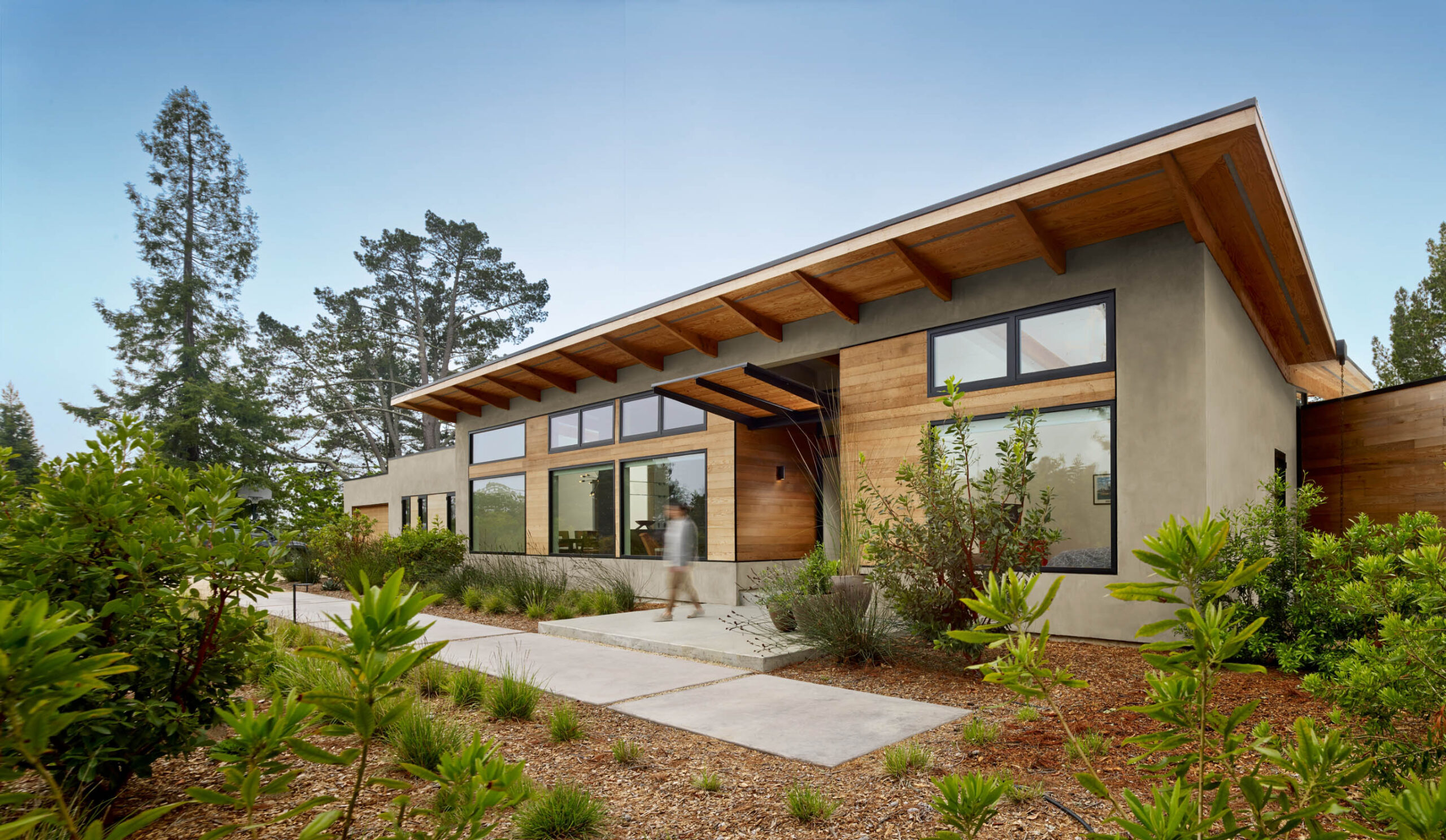
William Duff Architects is known for thoughtful architecture rooted in the style and design sensibility of Northern California. With their 25th anniversary on the horizon, WDA asked us for a new integrated branding program that would express their ambitions as a firm and showcase their award-winning portfolio. We re-envisioned the firm’s visual identity and developed an extensive suite of print and digital collateral — including a new custom website — to reflect WDA’s forward momentum.
Scope of Work
Brand Strategy
Content Strategy
Messaging & Copywriting
Art Direction
Visual Identity System
Illustration
UX/UI Design
Website Development
Photography
Videography
Print & Digital Templates
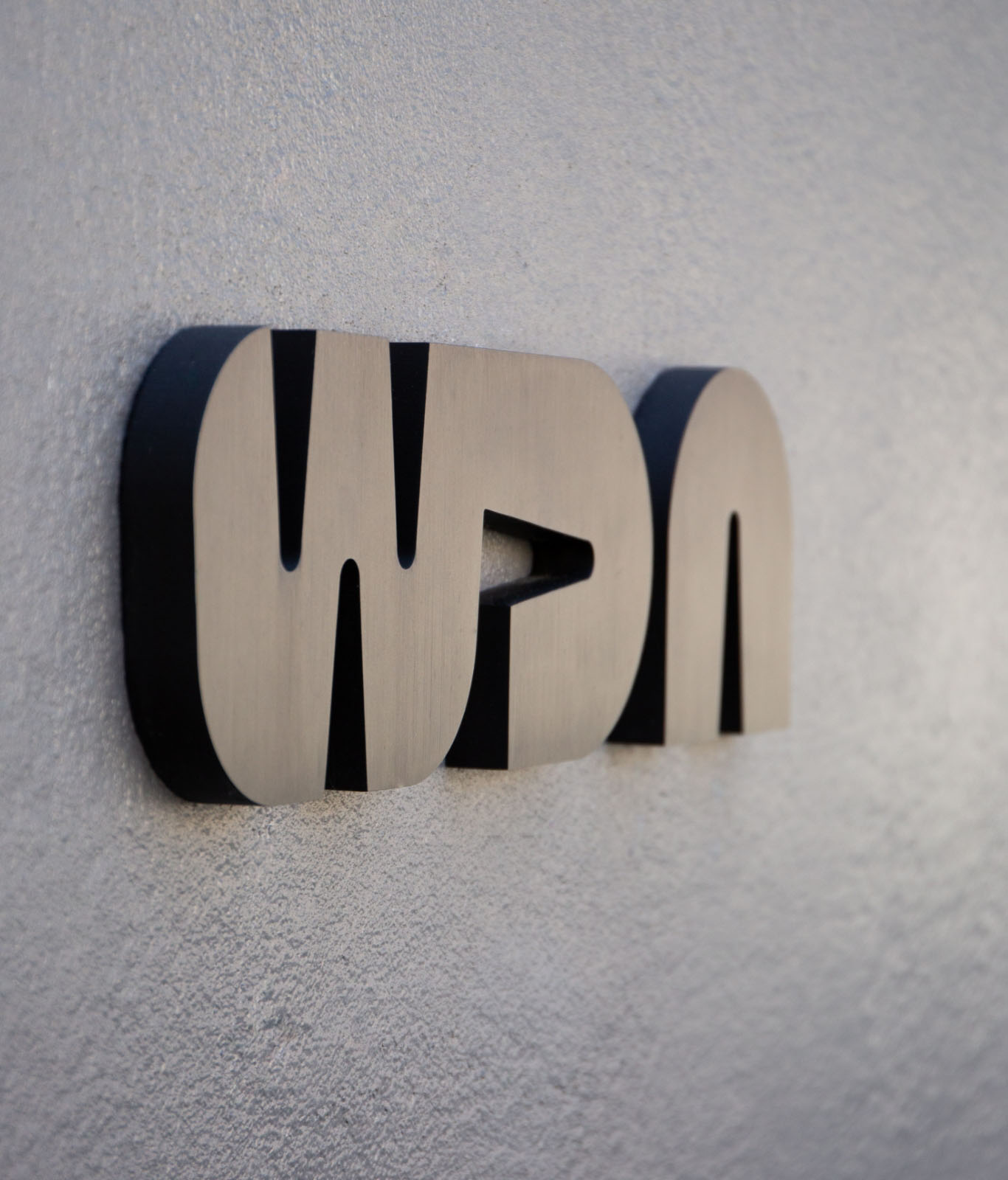
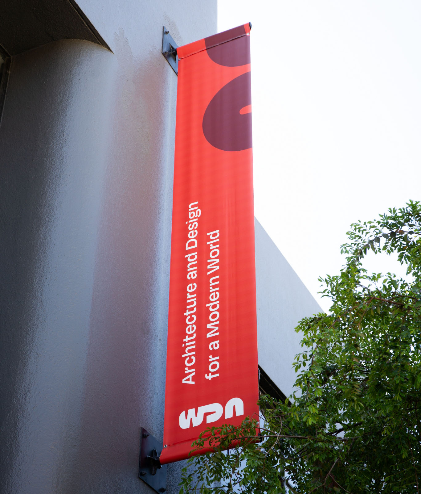
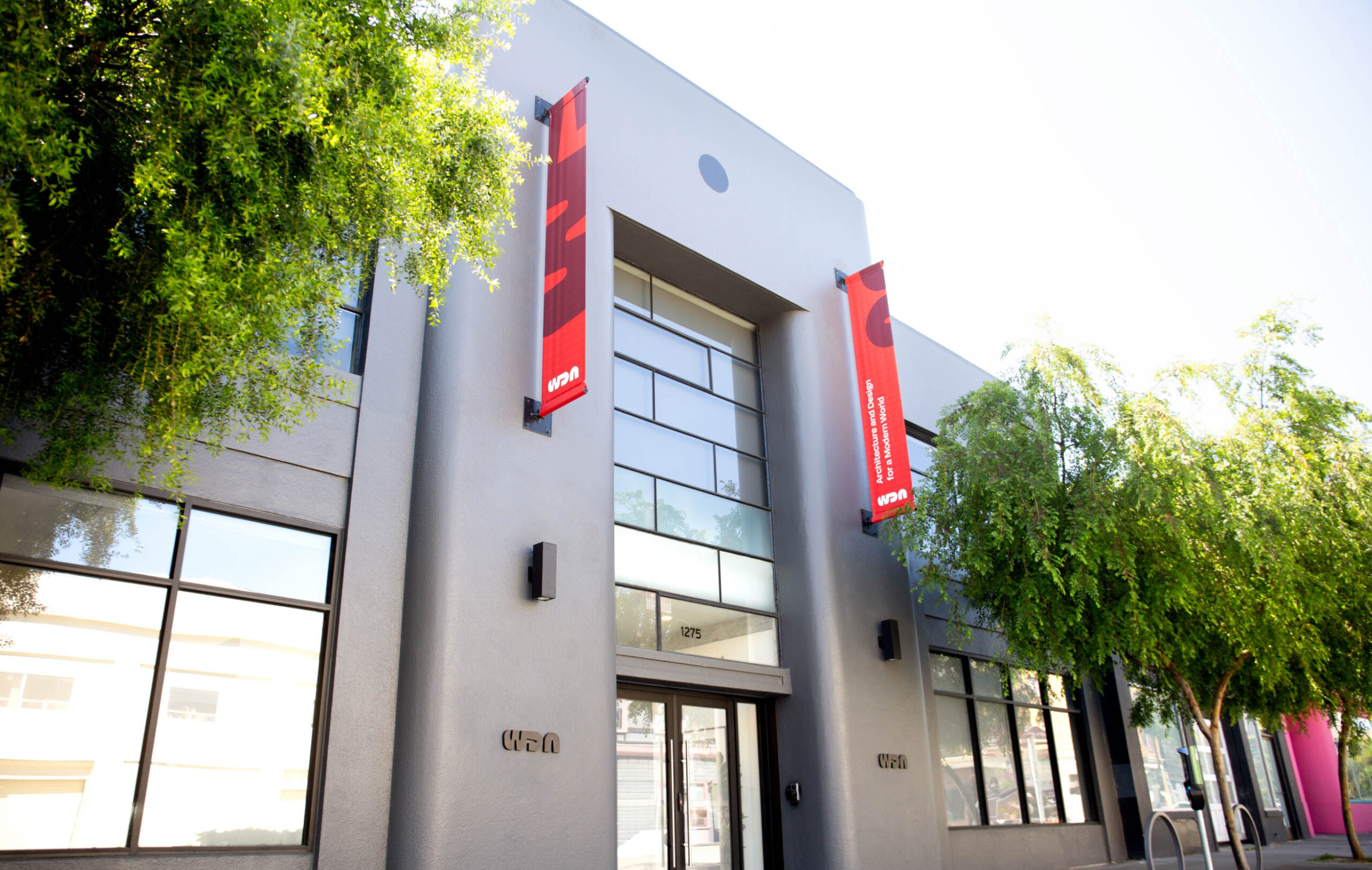
Signage
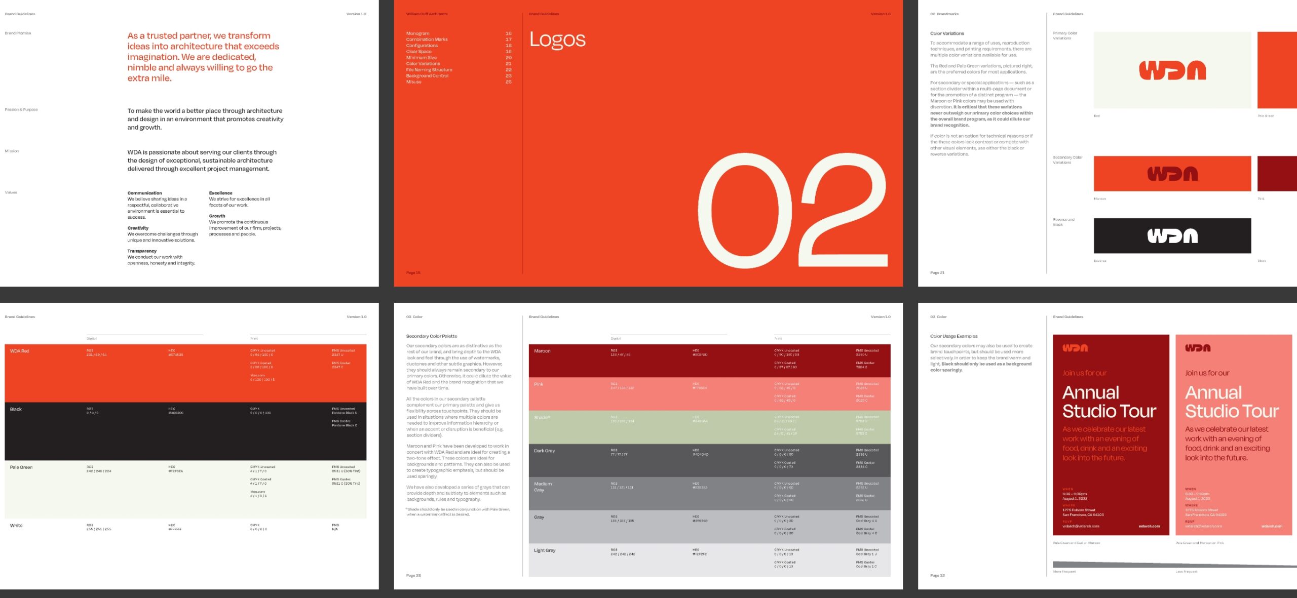
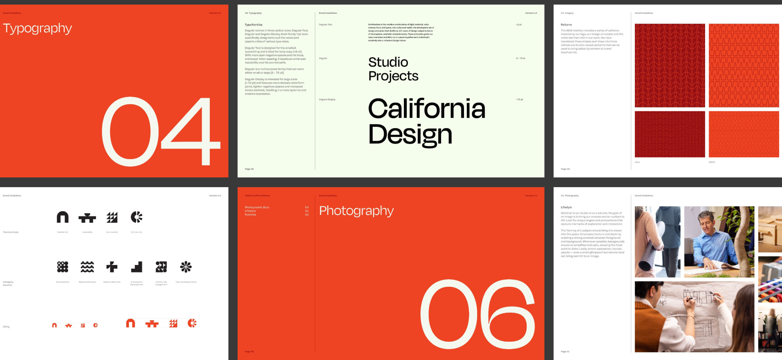
Brand Guide
WDA’s previous branding faded into the background and lacked the range necessary for full digital and physical expression. Our challenge was to create a bold and elegant identity that was worthy of standing alongside their work and flexible enough for the rapidly growing company.
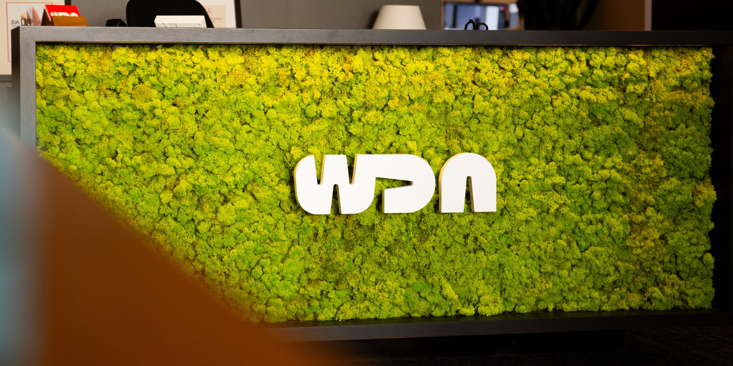
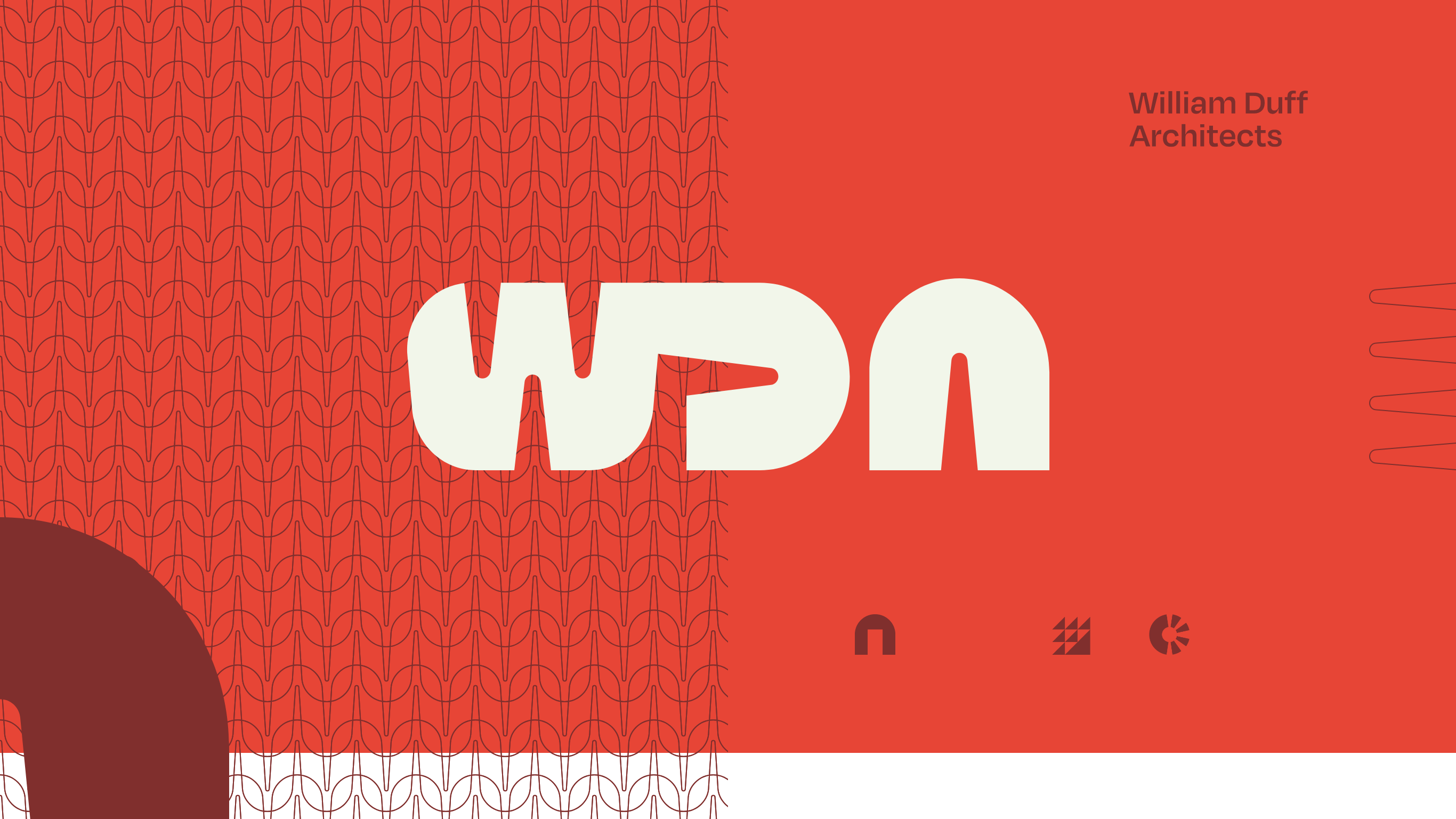
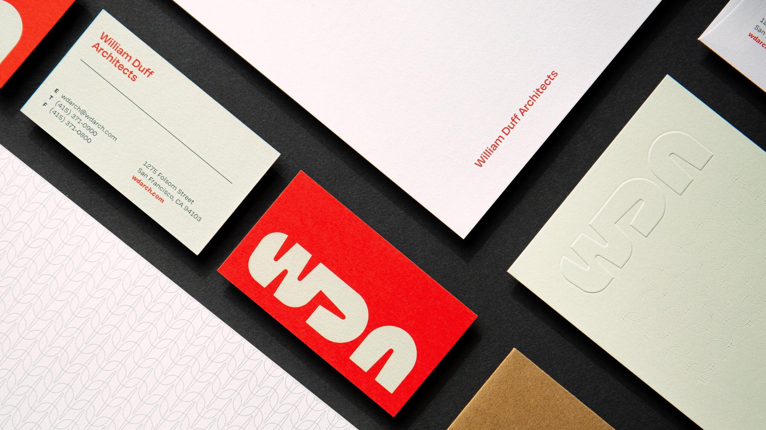
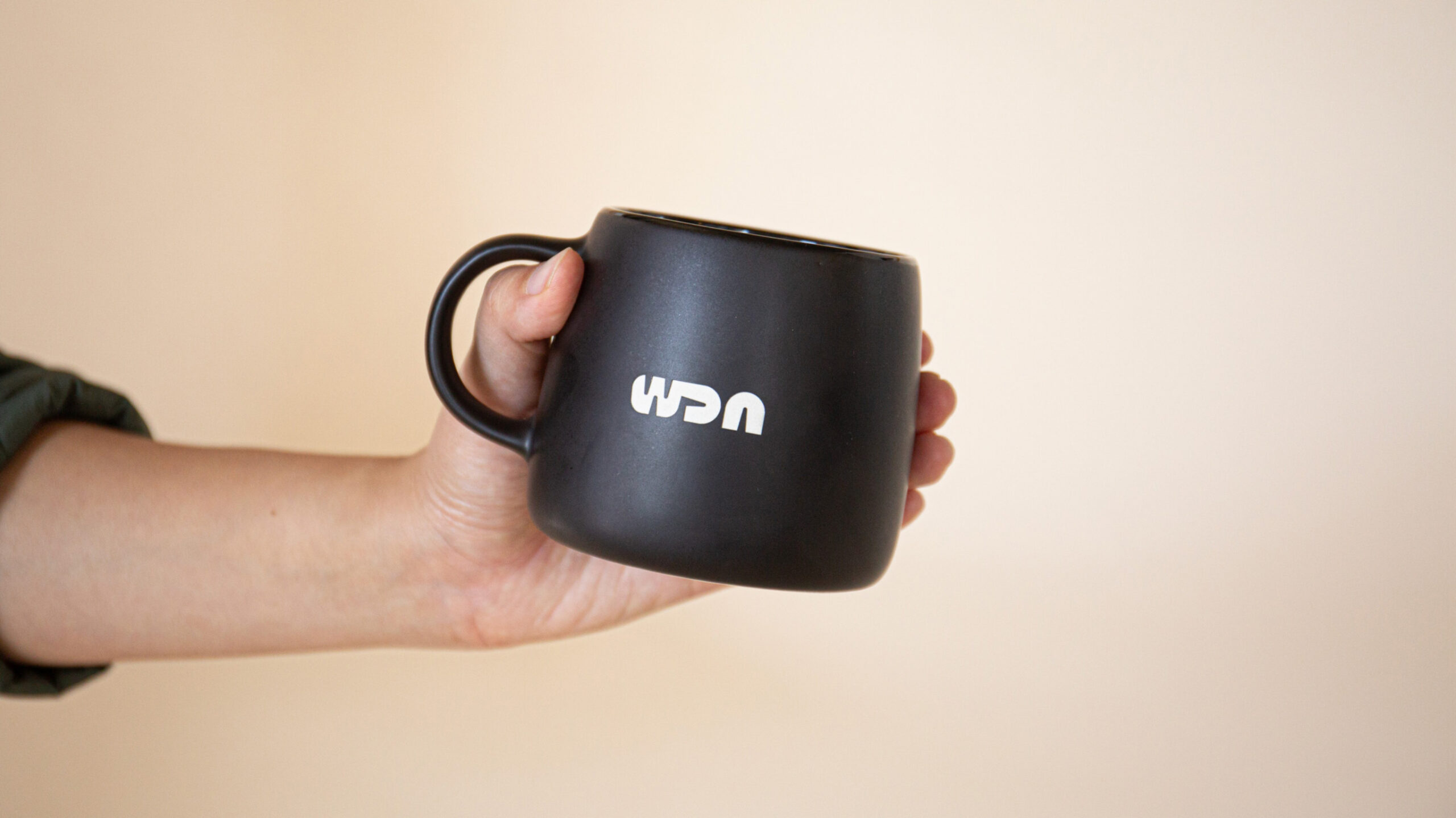
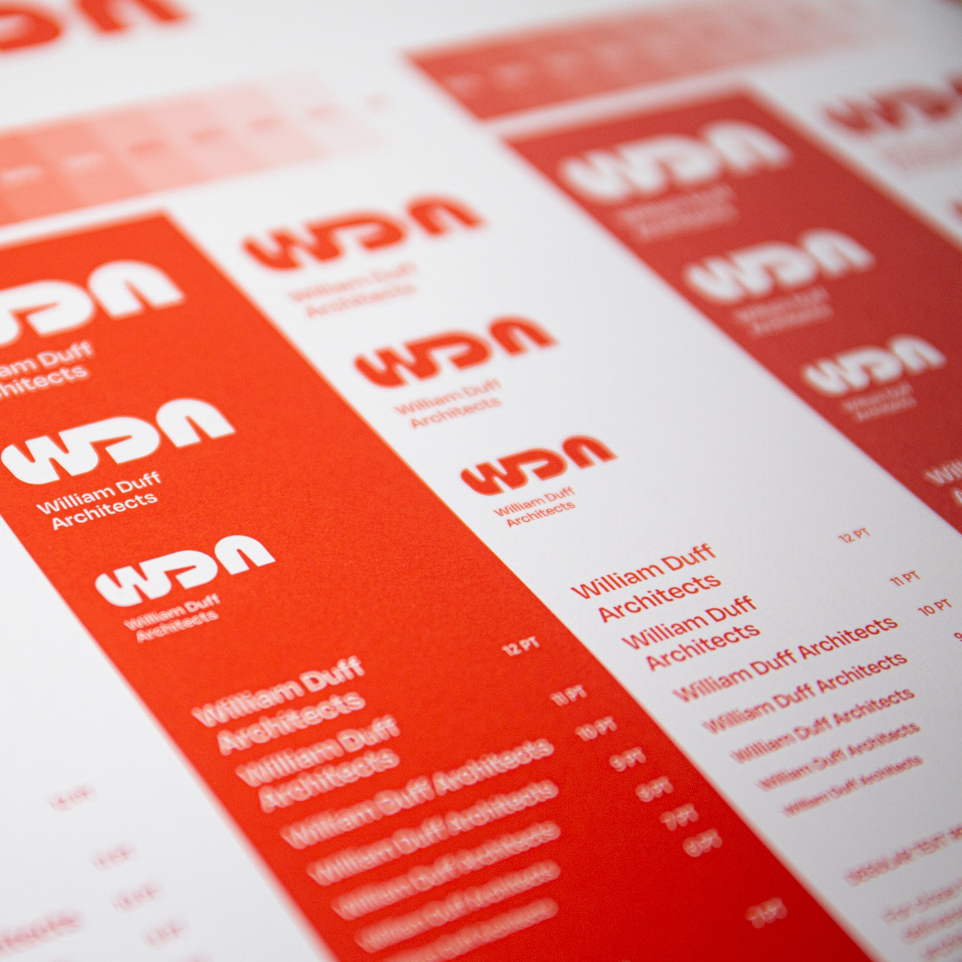
A rigorous process inspired by WDA’s own work and design principles yielded a mark with both weight and fluidity — in contrast to the stark minimalism common in their industry. The new identity makes its presence felt through bold letterforms with a sense of materiality and scale. The mark’s distinct curves also echo the importance of sculpting space and provide a nod to WDA’s dedication to natural elements.
To further differentiate the brand, we avoided the typical industry palette of black and white. Instead, we embraced a range of vivid reds and pale green, bringing both warmth and energy to WDA’s collateral.
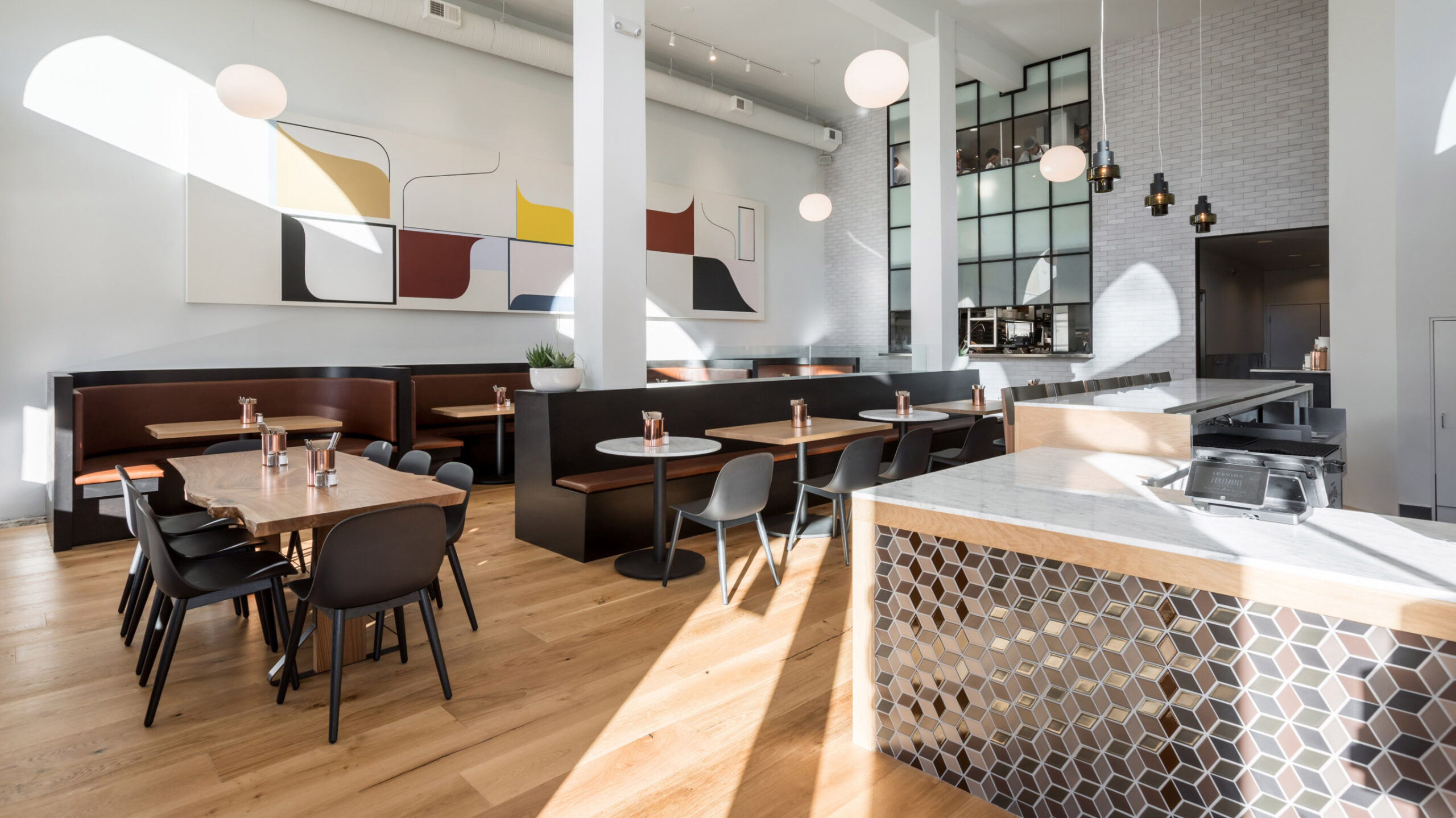
With the new identity in place, we began to rebuild WDA’s website from the ground up, showcasing WDA’s work in a way that highlighted the collaborative nature of the firm and their forward-thinking approach. Doing so meant designing a modern, content-rich site with high quality imagery and video elements that created opportunities for more showing and less telling.

The revamped WDA website announces a new era for the firm by foregrounding the strength and diversity of their portfolio. Copy throughout the site hits the balance between plainspokenness and technical expertise.
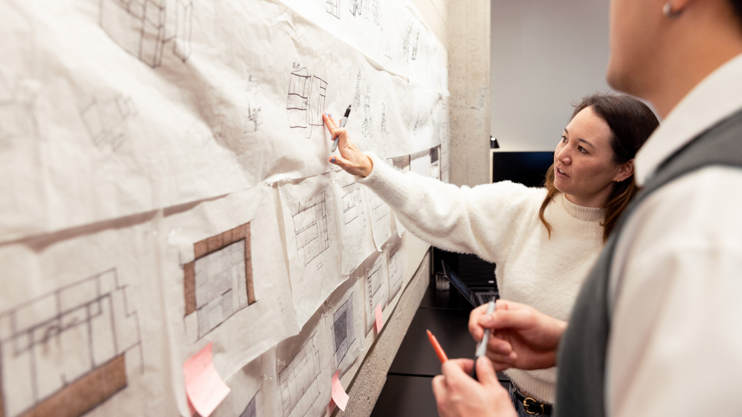
New video clips and photography provide glimpses into WDA’s process and vibrant workplace culture. |
New video clips and photography provide glimpses into WDA’s process and vibrant workplace culture.
We conducted portrait photography for 30+ staff members, and growing, from logistics and art direction to final image production. |
|
We conducted portrait photography for 30+ staff members, and growing, from logistics and art direction to final image production.
Case studies now feature clean and concise spaces for project specs and descriptions. The site design also incorporates full-bleed photography and a wide array of image gallery formats, allowing WDA’s work to truly shine and deepen the website experience.

We extended the identity and new design schemes to every touchpoint possible, including WDA’s critically important presentation materials and proposal documents. Orderly and adaptable layouts combined with a new type family consisting of both display and text styles give WDA the flexibility needed to convey a range of information.
We also developed a collection of custom iconography to help audiences navigate WDA’s practice areas and offerings. The icons were designed using a shared visual vocabulary that evokes the forms and impact of the WDA logo, with a focus on scalability.

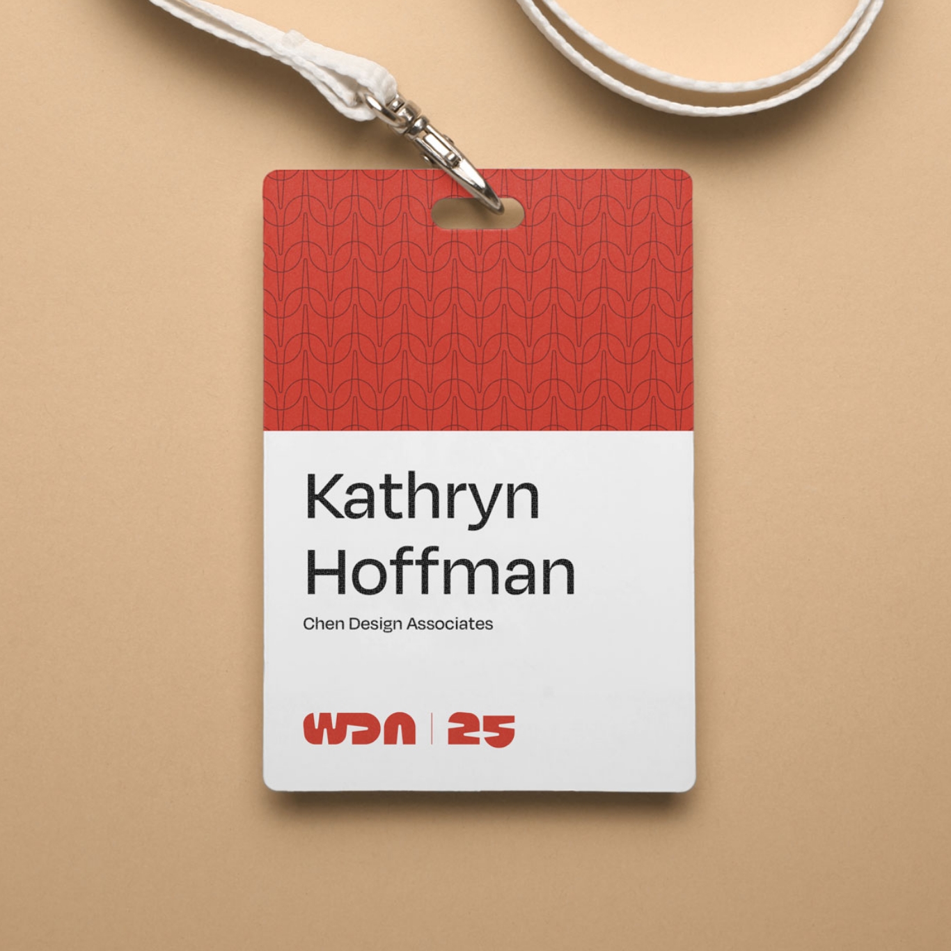
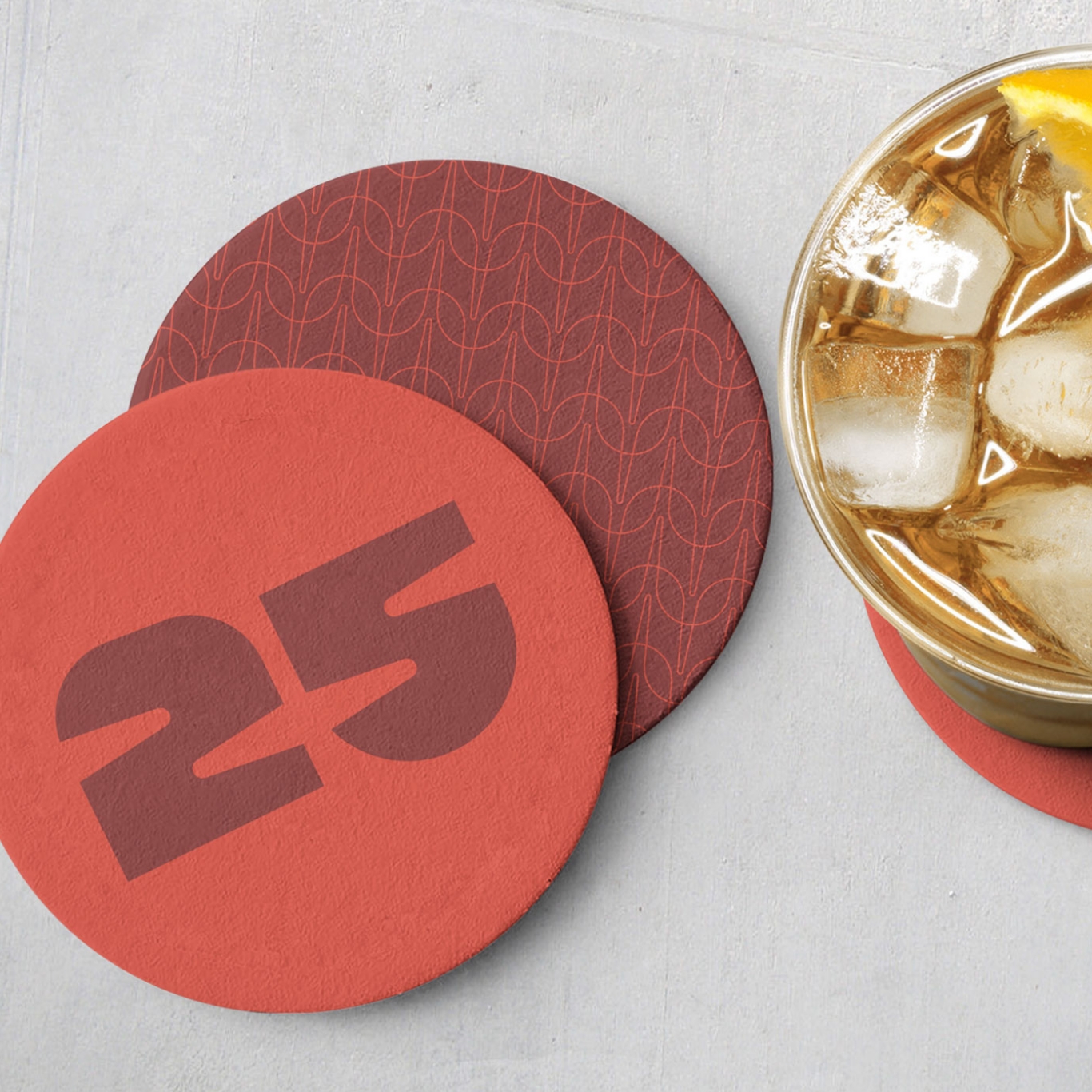
A set of custom patterns — each inspired by forms found within the WDA logo as well as common building and interior materials — brings texture and style to the WDA identity. The delicate lines and precise geometry of the patterns also serves to reinforce the elegance and attention to detail that WDA has become known for.
This expansive toolkit of type, colors, patterns, and graphic elements allows for greater dynamism and expression of the WDA brand.
To help bring the new identity to life, we developed a comprehensive Brand Guideline that not only provides detailed usage instructions for the visual identity, but also includes a Messaging Playbook to guide copywriting — ensuring the brand’s verbal expression complements its visuals.
![]()
To cap off the launch of WDA’s new identity, we also created a 25th Anniversary mark for the firm that could sit seamlessly alongside their new logo.
This new look not only positions WDA to grow its business and pursue more ambitious projects, but also serves as a north star reminding the firm of who they are and where they hope to go in the next 25 years of the company.
“You took the whisps of an idea and turned them into a gloriously beautiful reality that is exciting, original, and represents both who we are and who we want to be.”William S. Duff, Jr., Founder & Managing Principal, William Duff Architects