![]()
Real estate investment firm The Martin Group asked us to name and brand a new mixed-use development in Downtown Oakland.
Scope of Work
Market Research
Naming
Customer Insights
Positioning
Purpose & Values
Content Strategy
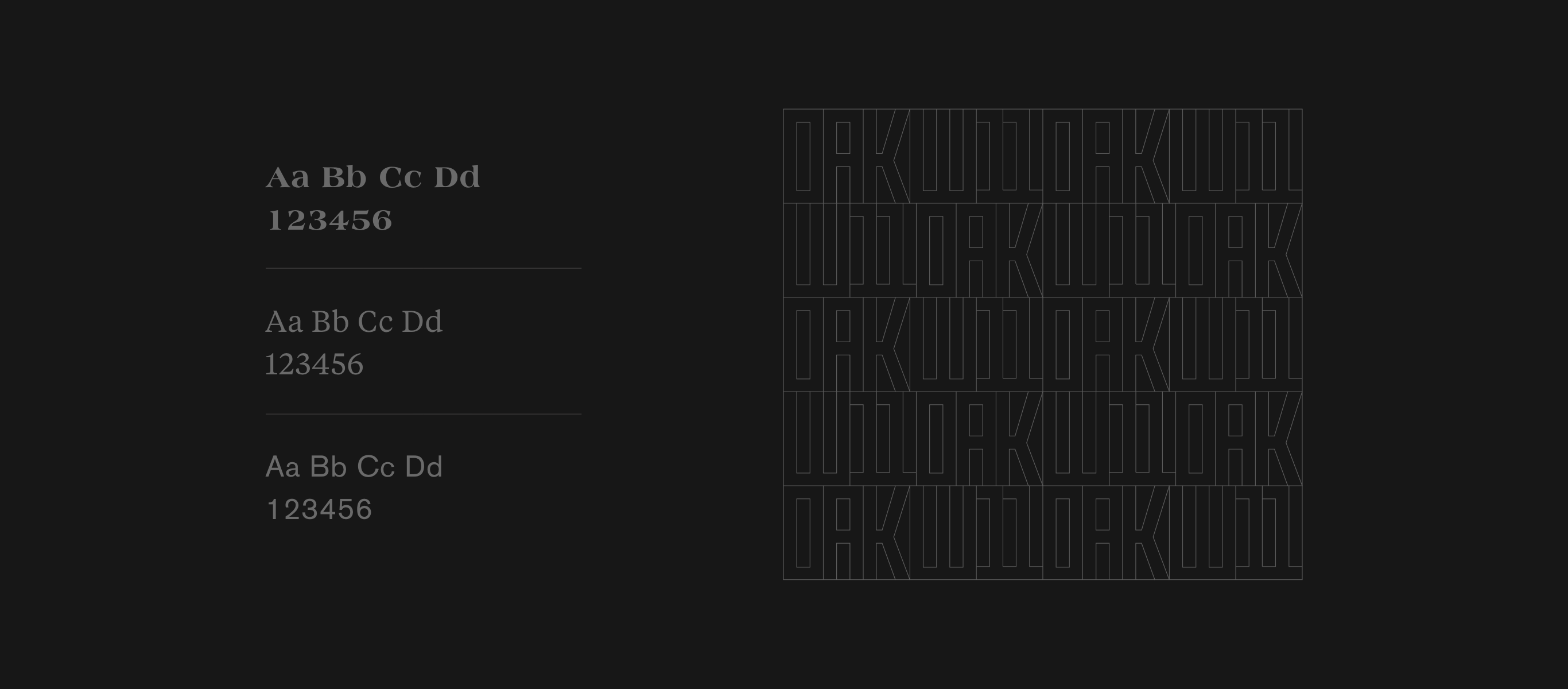
Visual Identity
Photography
|
Webster Eleven spans an entire block near Oakland City Center, steps away from public transit connections and dining and nightlife destinations. W11, as it’s known colloquially, is scheduled to open its doors in 2021 and will join a crop of other new residential developments that will add thousands of residents downtown. |
Webster Eleven spans an entire block near Oakland City Center, steps away from public transit connections and dining and nightlife destinations.
W11, as it’s known colloquially, is scheduled to open its doors in 2021 and will join a crop of other new residential developments that will add thousands of residents downtown.
Strategic Foundations
Starting with research and interactive stakeholder workshops, we created a brand strategy that positioned this development as a dynamic new hub for living and working in the heart of Oakland.
With over 300 residential units, multiple communal areas, on-site childcare and fitness center, and ground level retail, Webster Eleven is a modern living community where people come together to connect, discover, and learn.

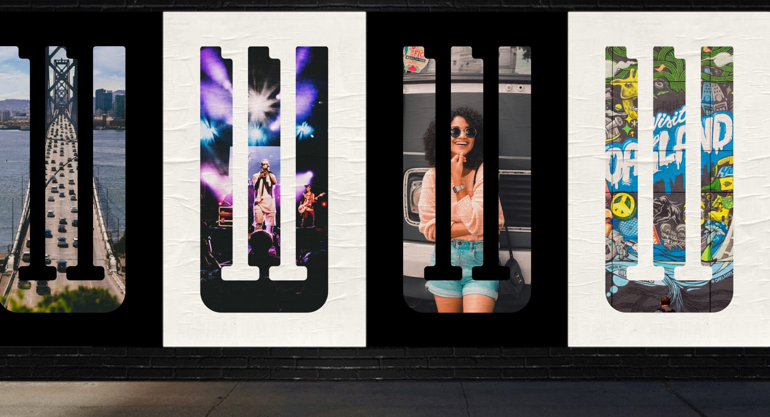
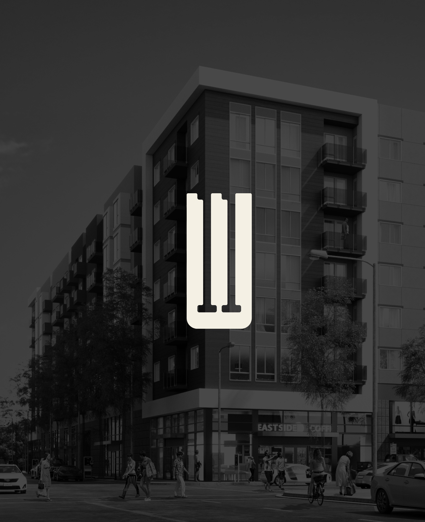
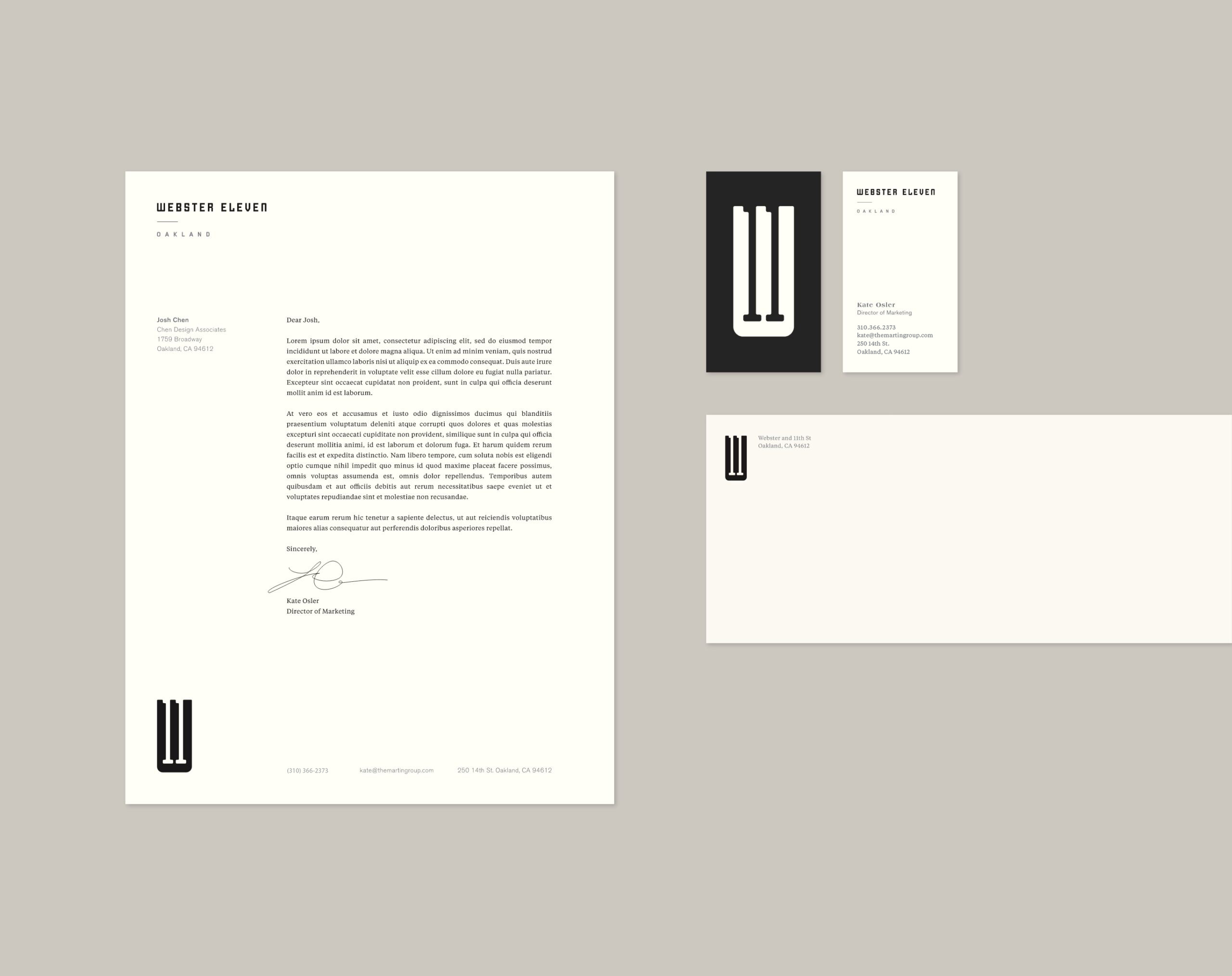
Classic and Confident The primary logo is a classic black and white execution combined with clever interaction of bold lines and positive and negative space. The bold lines and overlapping forms mimic the building’s sleek design as well as the intersection of the streets that give the development its name. |

|
Classic and Confident
The primary logo is a classic black and white execution combined with clever interaction of bold lines and positive and negative space. The bold lines and overlapping forms mimic the building’s sleek design as well as the intersection of the streets that give the development its name.

“Chen Design’s strategy-based approach to design delivers results that play off market trends, resonates with customers and guarantees success for our products. It is such a relief to work with a team that delivers high-quality, thoughtful results each and every time.”Kate Osler, Director of Marketing & Leasing
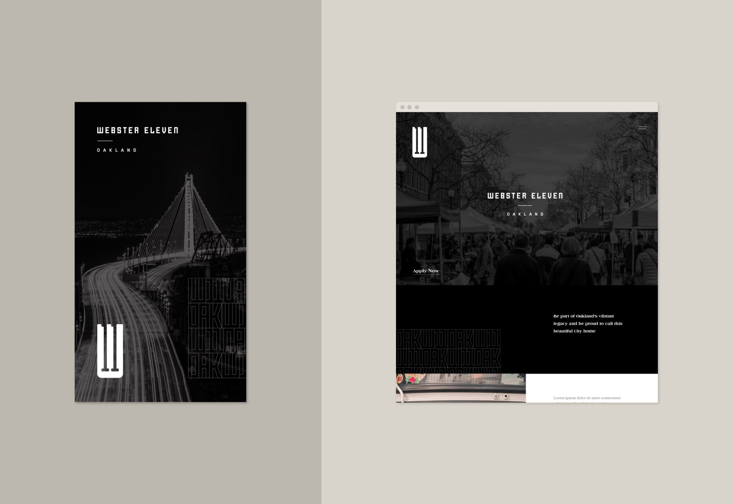
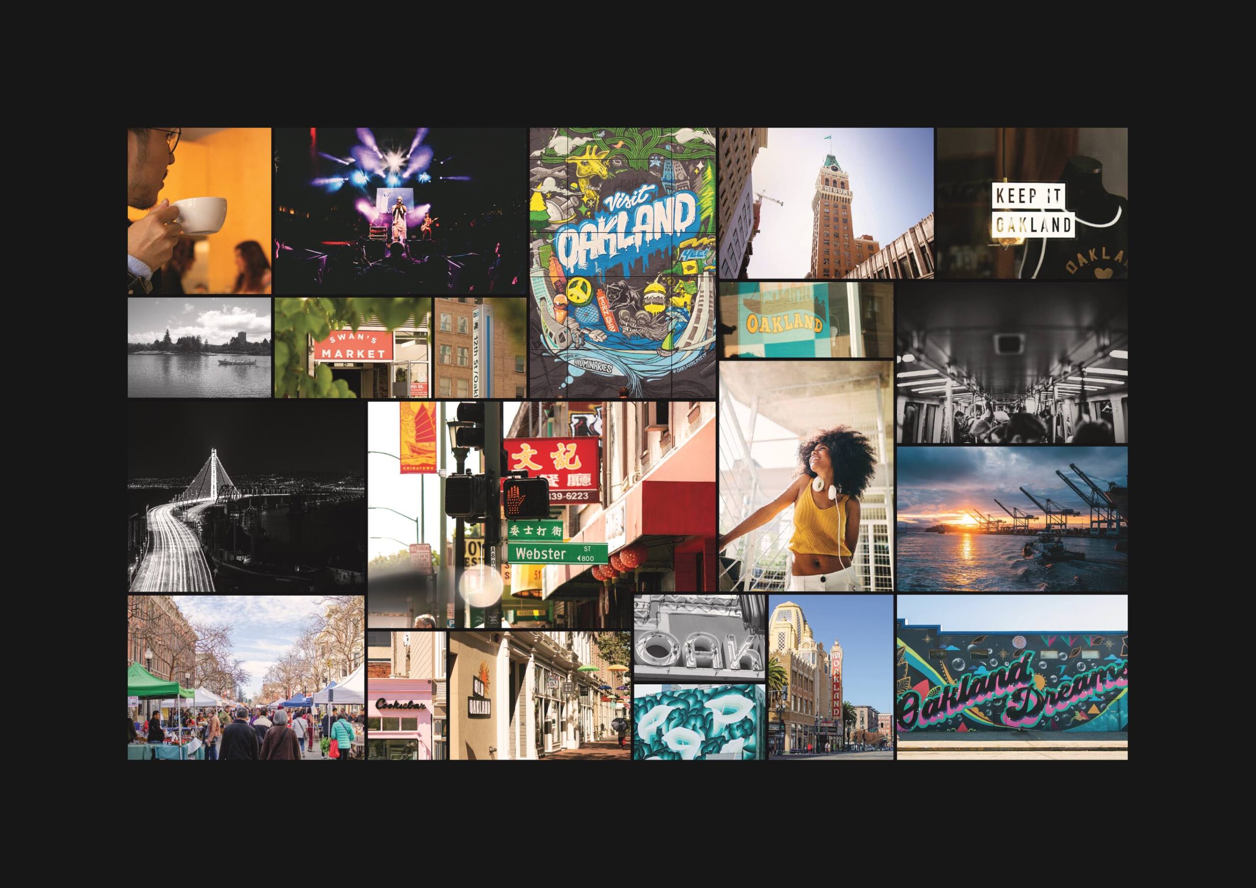
Celebrating the City
The simplicity and confidence of the black and white logo design is paired with color photography that highlights the speed of life in the neighborhood and the possibilities contained within it.
Our art direction mixes original and stock photography featuring people and locations in the immediate area, underscoring the building’s identity not just as a hub for the community, but also as a good neighbor.