

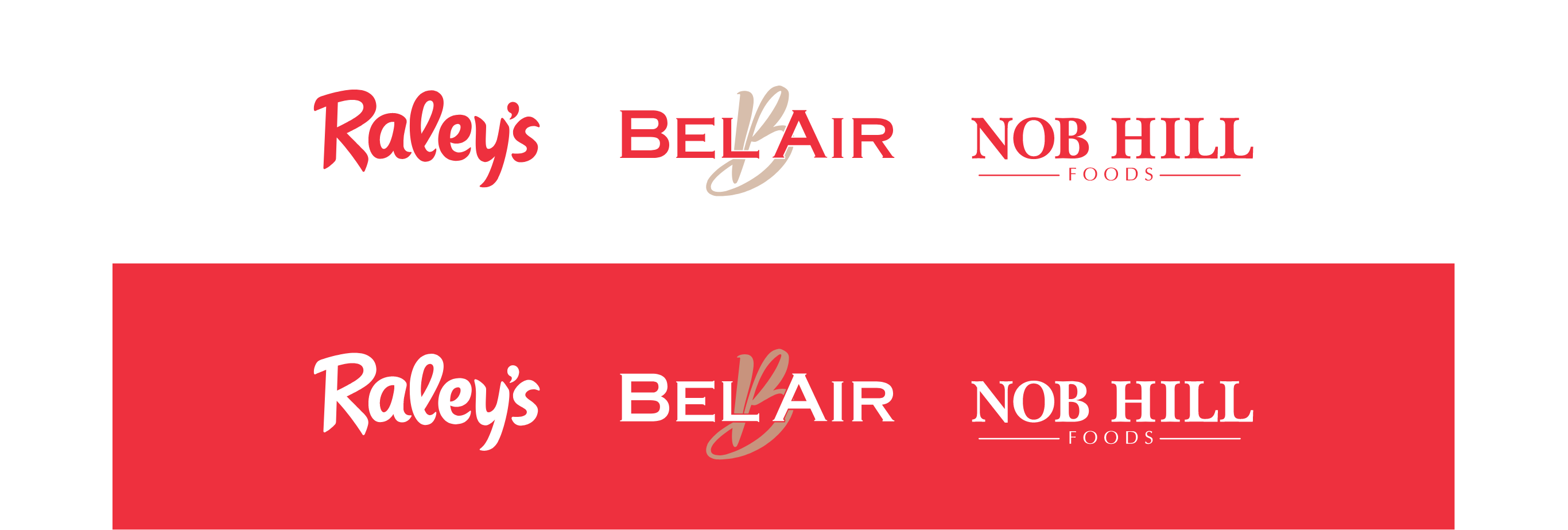
Raley’s is a family-owned and purpose-driven retail company headquartered in West Sacramento, California, making healthy food accessible since 1935. Committed to quality offerings, customer service, and its communities, Raley’s owns and operates more than 235 locations under nine well-known banners across eight states and four Tribal Nations.
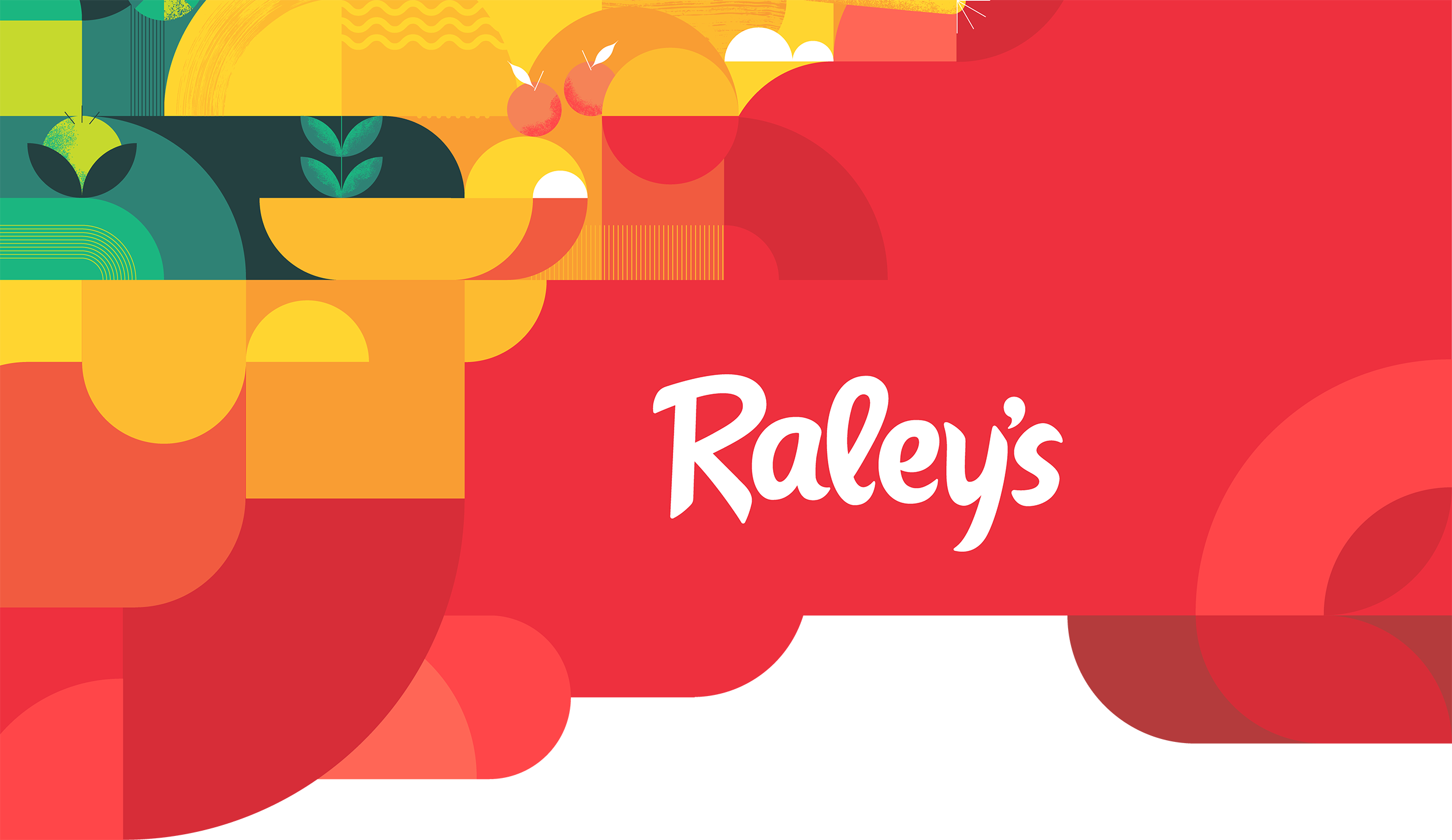
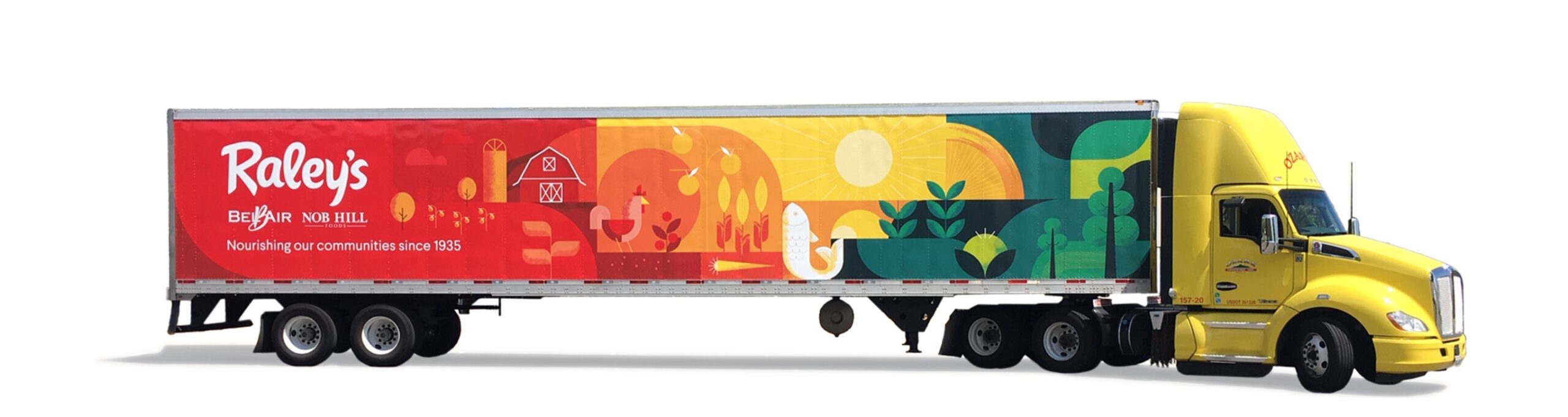
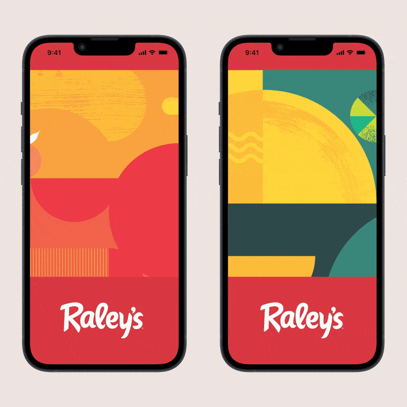
Our team was hired to refresh Raley’s existing brand, rethink how its working elements could best be used, and create a comprehensive brand book to guide internal teams to successfully tell Raley’s story. Not an overhaul from the ground up, our goal was to provide an incremental remodel toward building a cohesive experience across all touchpoints whether a customer steps foot in-store, shops online, views print ads or a truck passing by. With consistency and time, these applied tools increase brand longevity, awareness, and credibility.
Scope of Work
Competitive Research
Brand Strategy
Brand Identity & System
Art Direction
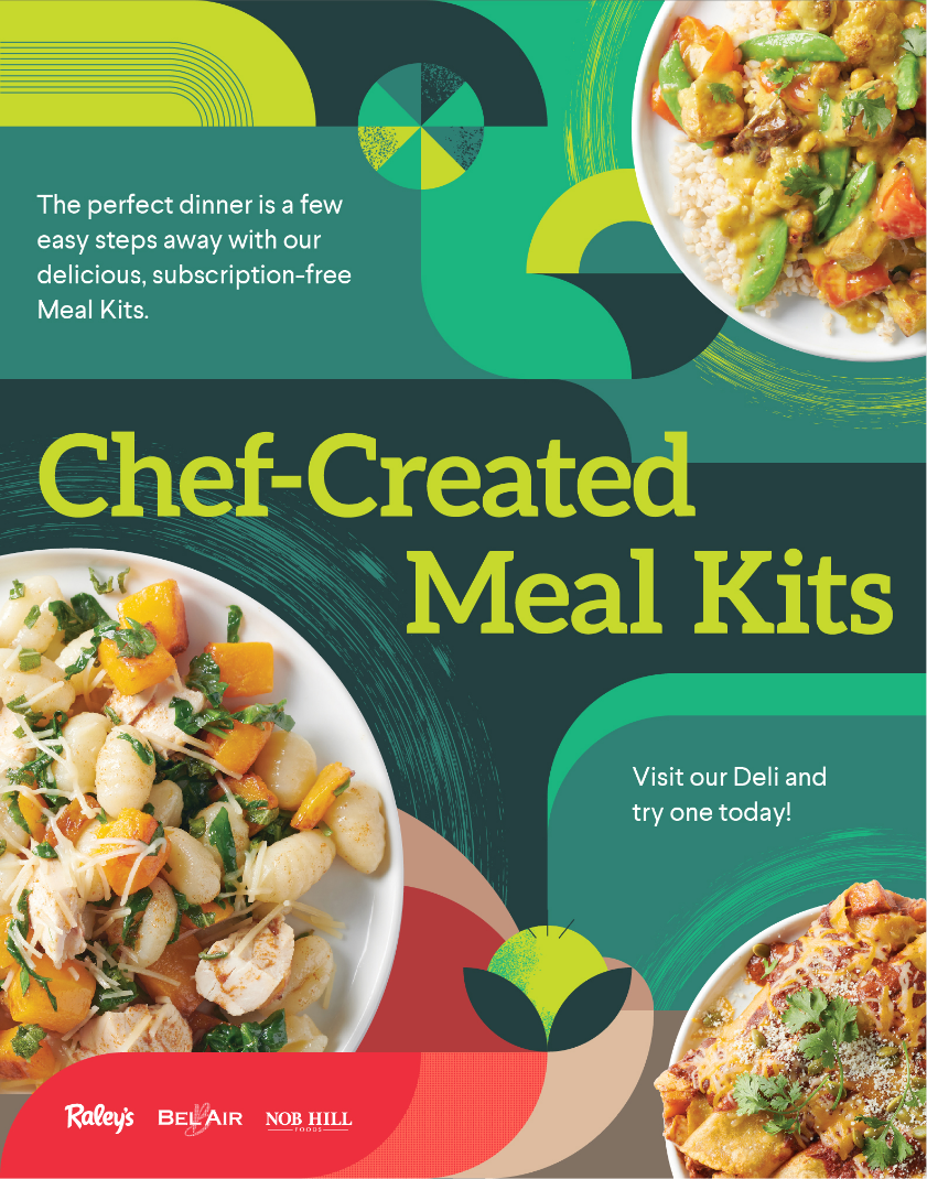
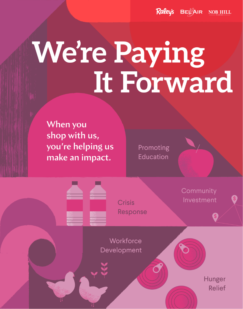
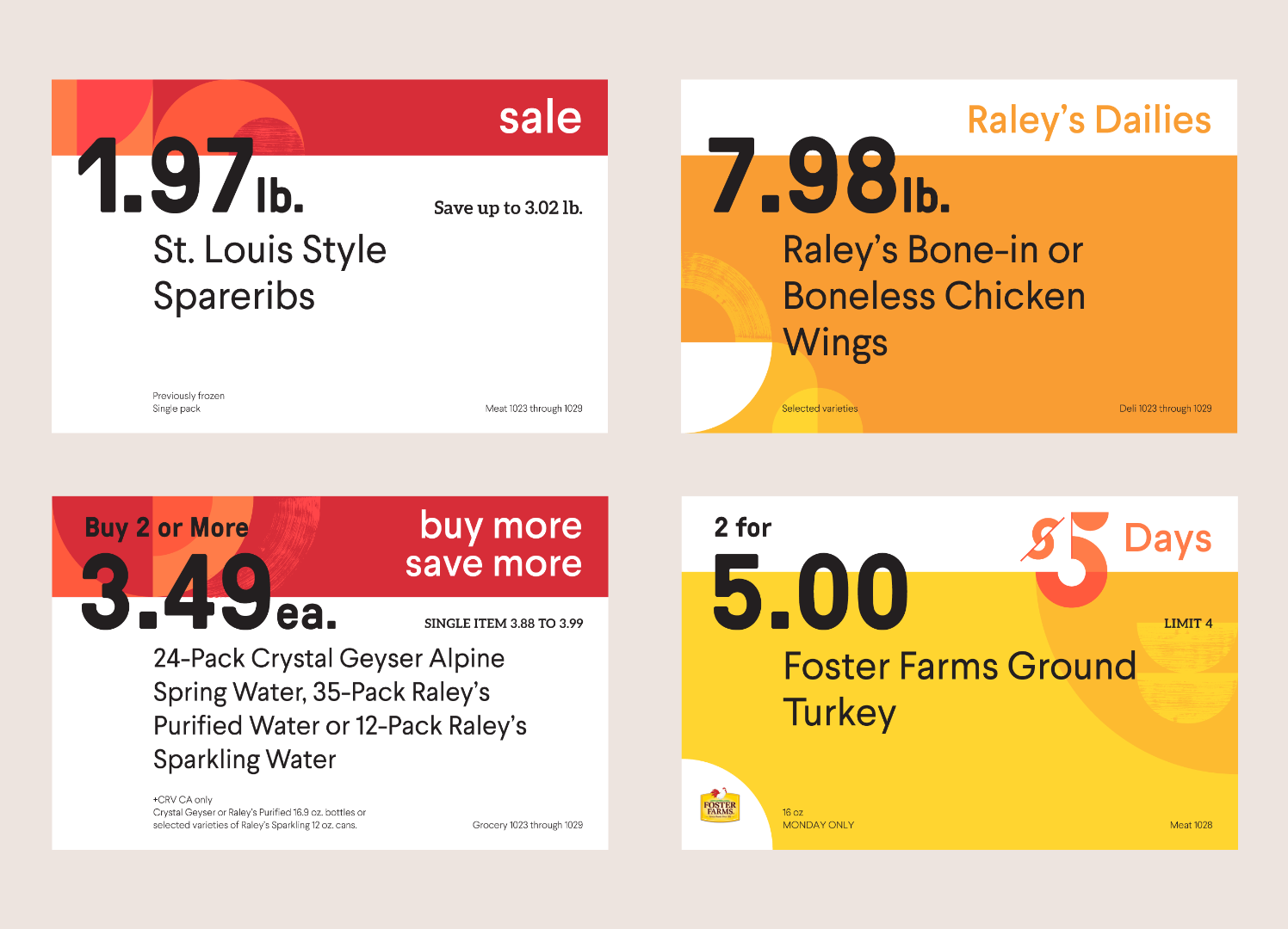
Print Collateral
Experience Design
Typography
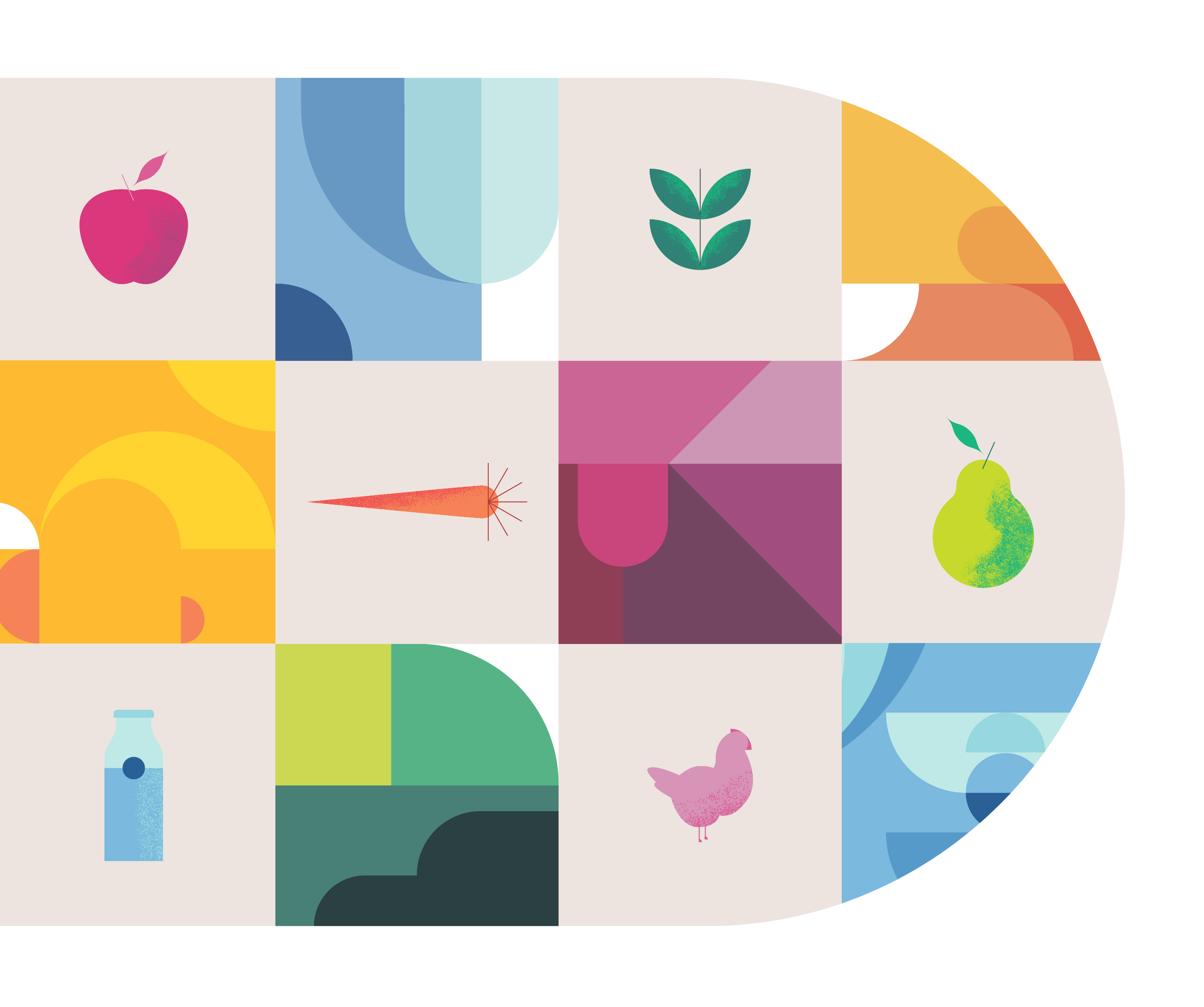
Illustration
Brand Guidelines
“We can’t thank Chen Design enough for their incredible work in giving Raley’s brand a refreshing makeover and crafting a complete brand book. Their expertise has been instrumental in helping our teams effectively tell the story of Raley’s and create a seamless brand experience.”
Tricia Wong, Senior Director of Marketing at The Raley’s Companies
Our team conducted on-site visits, then led two full-day workshops to immerse ourselves in the experience and inner workings of the Raley’s brand. We gained clarity on team-specific needs while unifying around Raley’s overarching business objectives. Through these workshops we became equipped with the context and information needed to move forward.
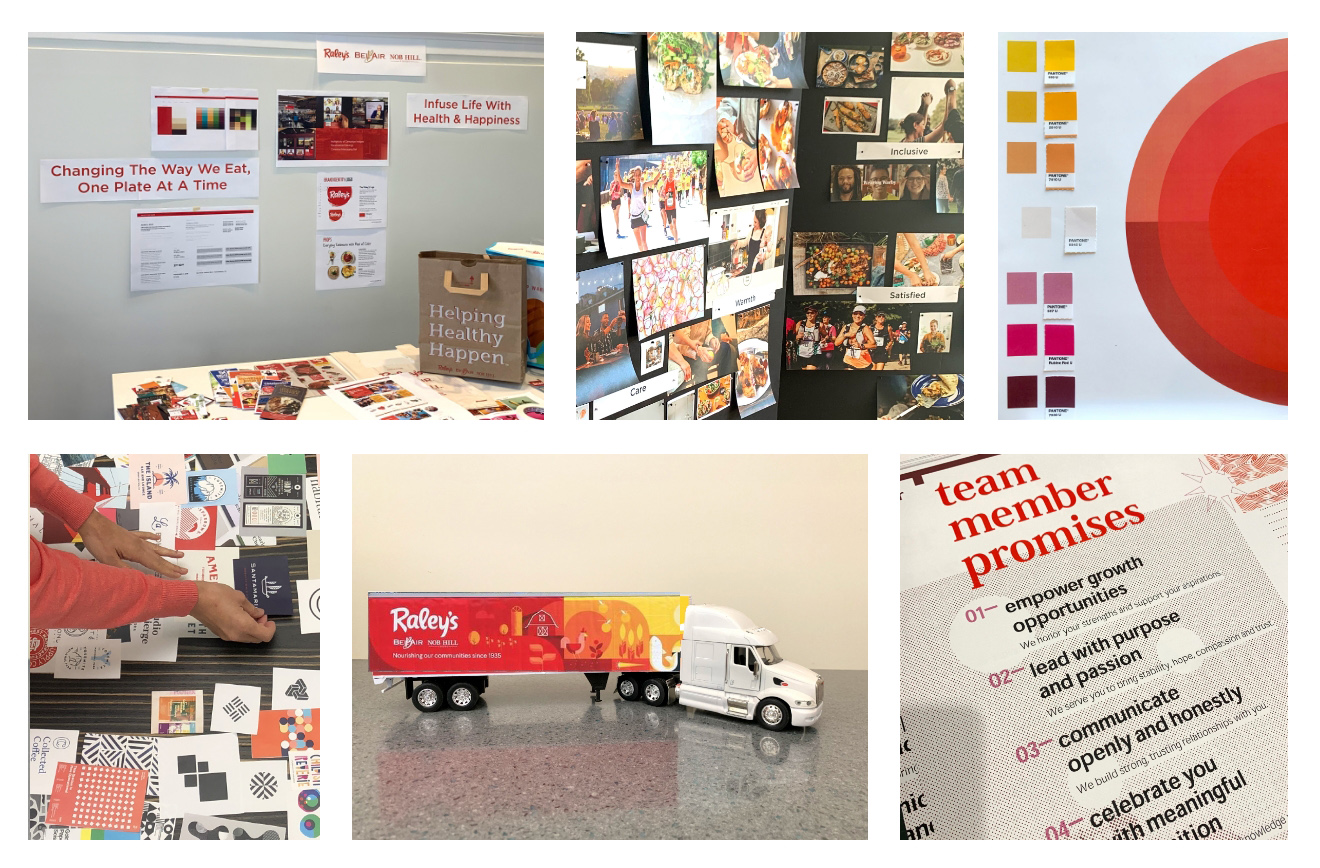

Our work included facilitating a dialogue with stakeholders around collaborative, active problem-solving. As a result, we devised a framework to express the Raley’s brand using four brand pillars: Wellness, Community, Delight, and Trust.
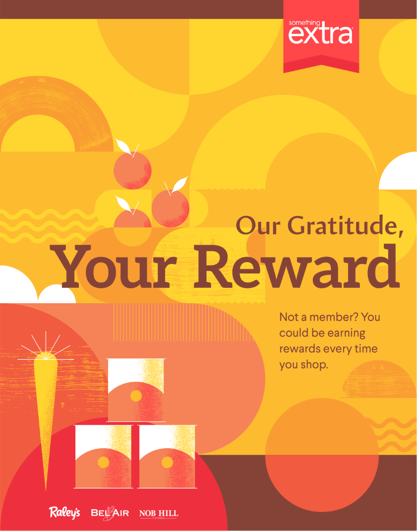
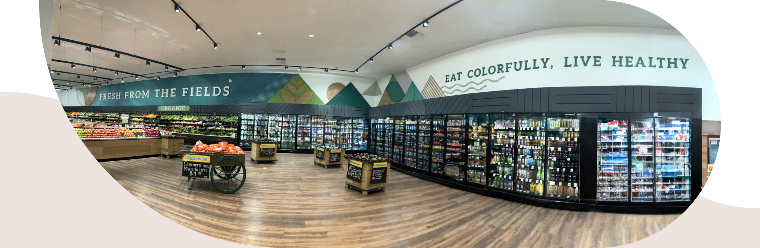
Working within existing brand constraints, we made modern evolutions in the visual look and feel that unify across the whole brand expression. We also took into consideration that Raley’s unique approach allows each of its stores to reflect the individual and unique neighborhoods of its location. Our aim here was to respect the distinctiveness of each of the stores while creating a throughline that comes together under the overall Raley’s brand.

“We’ve seen remarkable improvements in how our brand stands out, gains recognition, and earns trust across different channels. Chen Design truly embodies exceptional craftsmanship, deep expertise, and a collaborative spirit, making them our top recommendation for anyone seeking remarkable branding solutions.”