We also facilitated multiple stakeholder workshops, creating opportunities for the leadership to strengthen their collaboration and ultimately create a stronger brand.
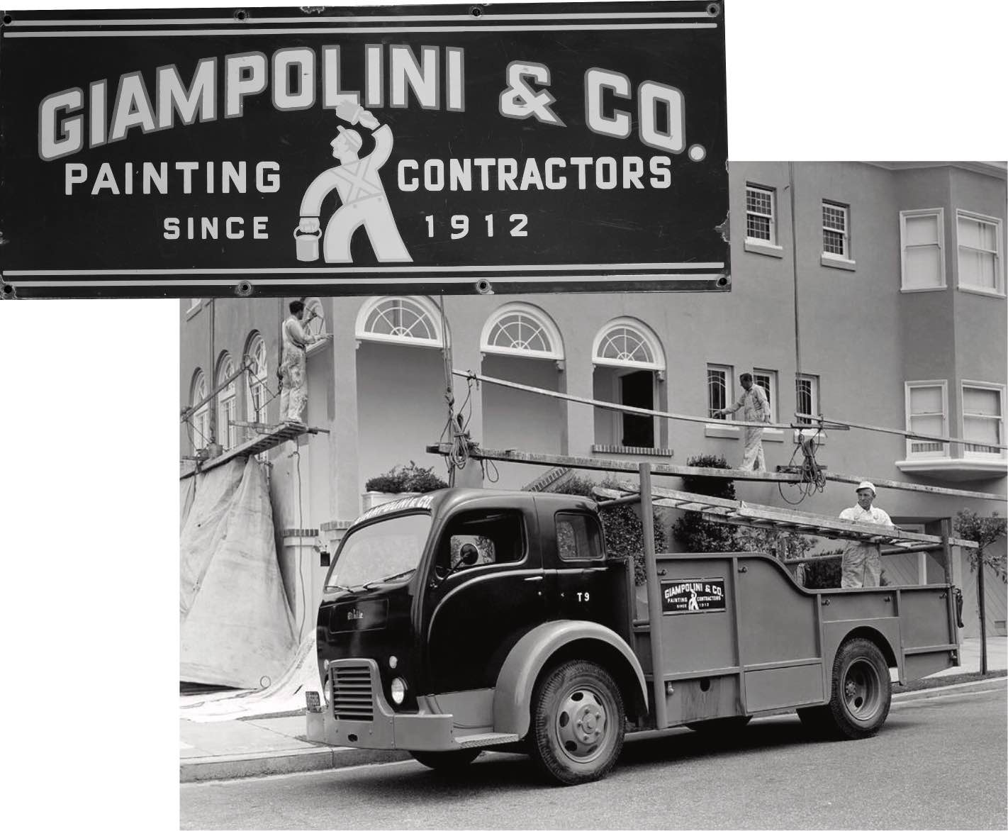
The Giampolini Group is a family-owned business with a proven track-record of quality work, strengthening trusted relationships and performing outstanding specialty contractor work since 1912. For a company with such established longevity, they were in dire need of a brand overhaul. We took the opportunity to transform the look and feel of the Giampolini Group into a brand that could smoothly progress into its next century of business.
Scope of Work
Positioning
Purpose & Values
Brand Architecture
Visual Identity Systems
Messaging & Copy
Brand Guidelines
Websites & Development
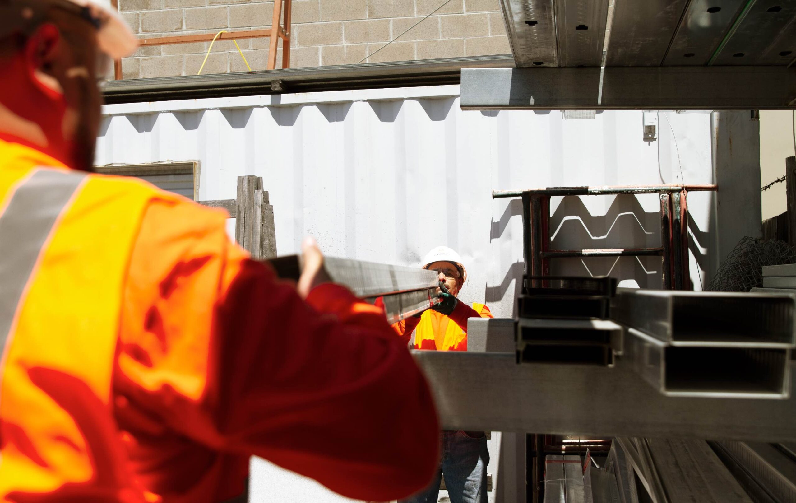
Photography
![]()
The Giampolini Group identity anchors all other brand elements—the year of establishment is juxtaposed by clean, contemporary type with 20th century influences. The three levels represent our three divisions, unified into one group. The “G” on top signifies our signature on each project. Evoking plans and construction itself, our mark is dynamic, engaging, and expresses our careful attention to detail.


Our brand strategy work was foundational to understanding Giampolini Group’s past, present, and future—we immersed ourselves in evaluating its history and strengths, public perceptions, competition, customers’ needs, aspirations and opportunities.
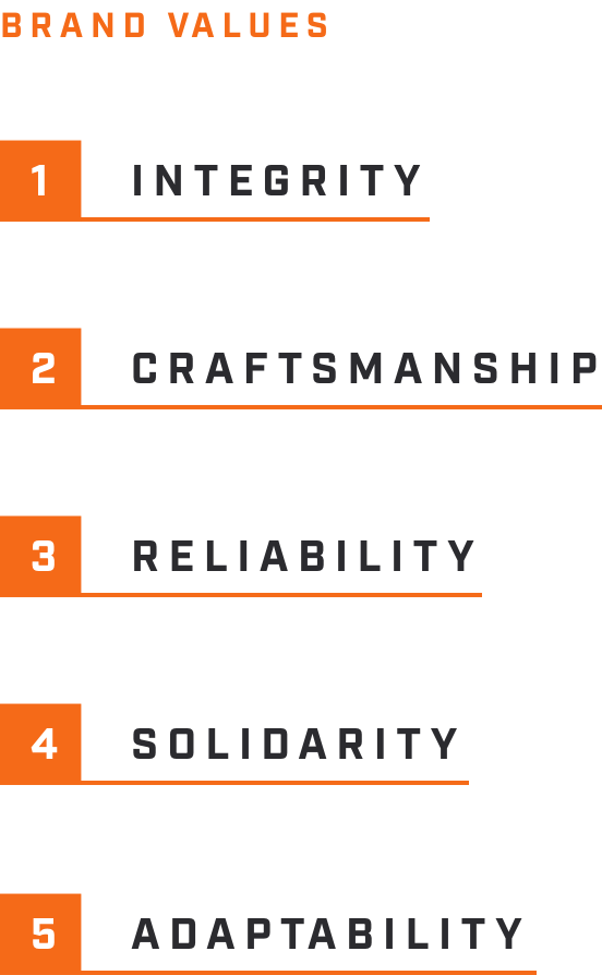

An important part of our rebranding process was to clarify brand architecture, articulate brand values, and align on brand positioning that would all inform the design of the new identity.
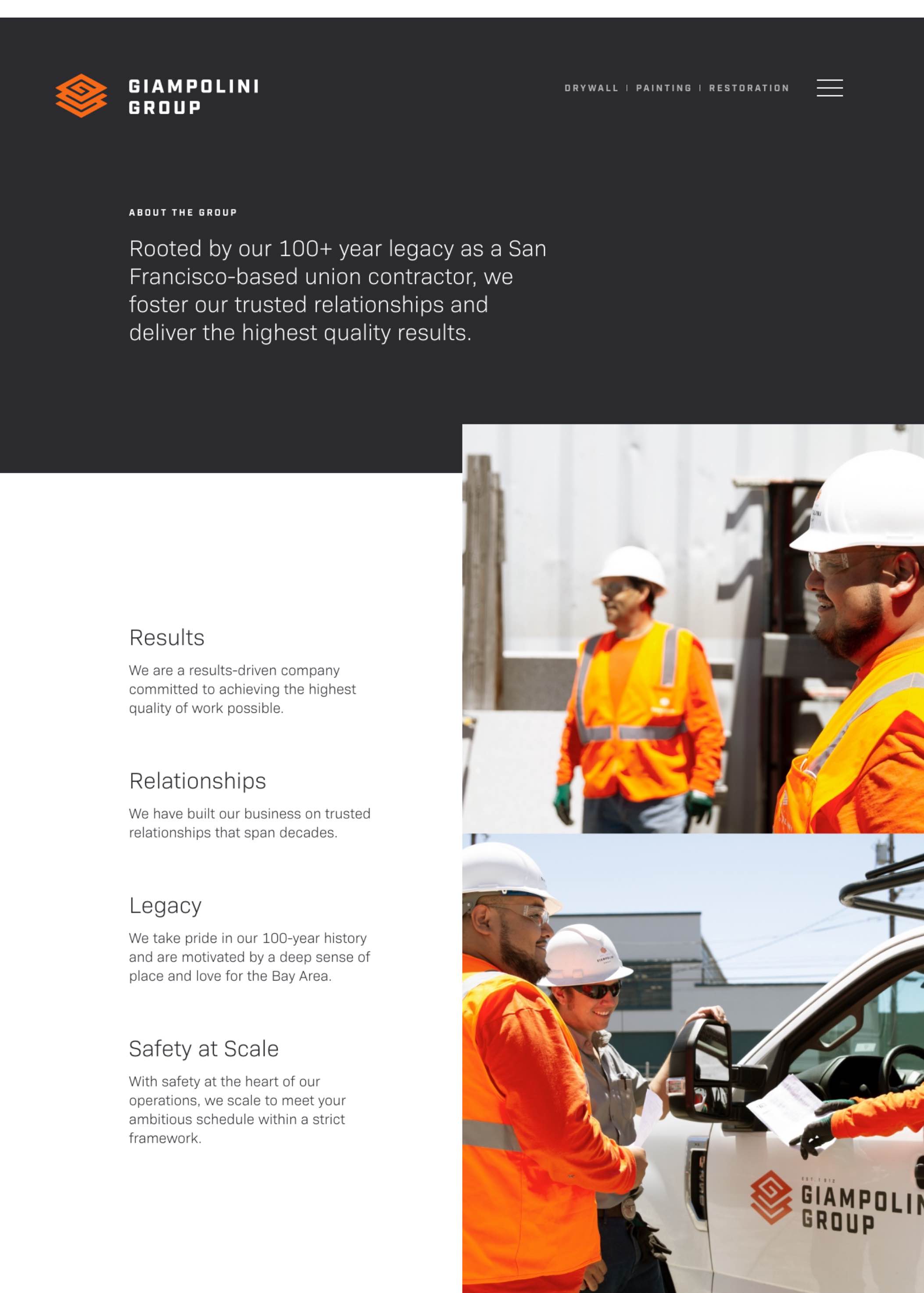
Our goal when building the website was to unify the divisions and the parent brand through shared visual elements and layouts, while using different colors to allow the unique capabilities and strengths of each division to be highlighted. We built the website with the future in mind, wanting to empower each division to update their online presence based on their individual needs.