

Ashley and Tom Darling are a husband and wife team in Sonoma producing minimal-intervention wines full of energetic character yet beautifully restrained. They approached us to give their brand identity a light refresh that highlights their passion for people and place.
Purity, Intention, and Quality
Tom and Ashley have a strong sense of mission and purpose, and we partnered together to finesse the details of their story and values into a clearer expression of their brand.
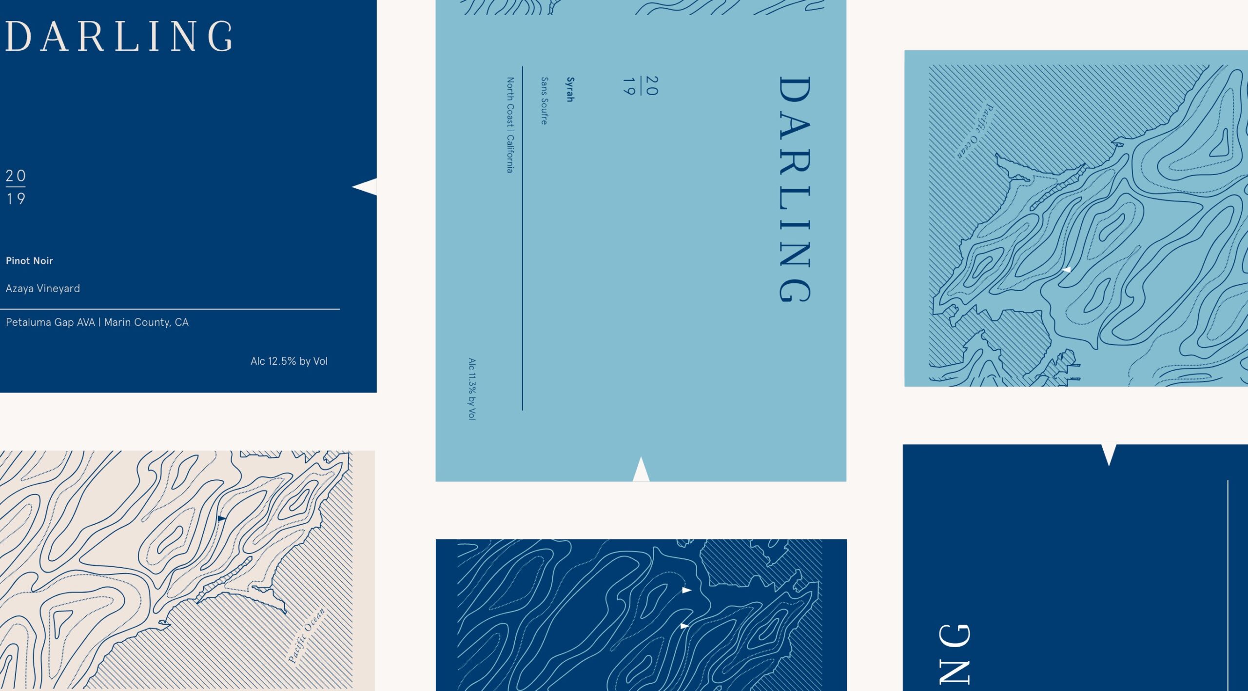
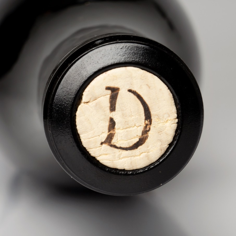
The updated “D” monogram is a nod to their move from the East Coast to beautiful wine country in Sonoma, and also contains a nautical spirit as many of their wines are made from vineyards in cooler, coastal climates.
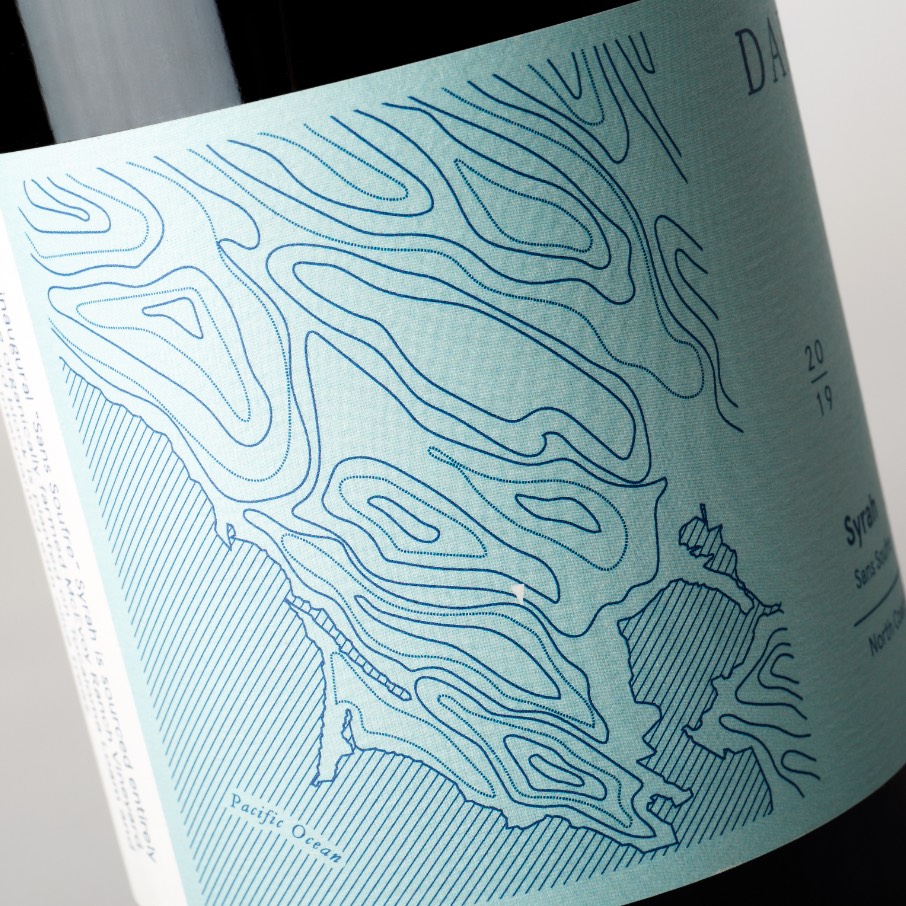
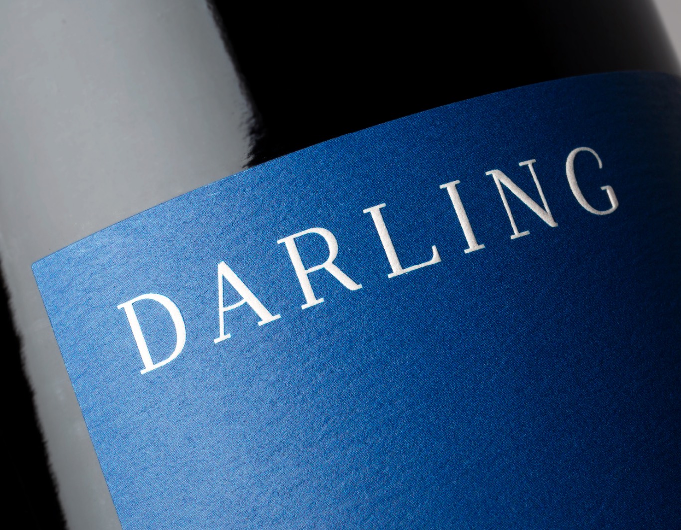
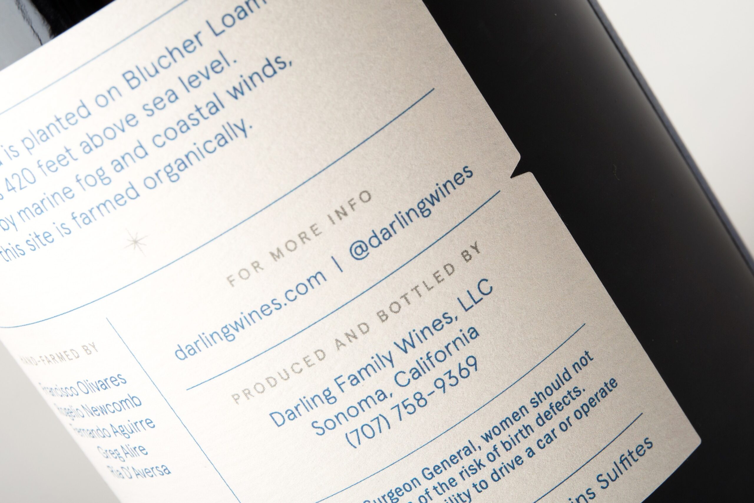
We reimagined the labels to showcase the topographic landscape of the vineyards while maintaining the minimal look and feel. Letting the wine and terroir shine was our goal, as there’s nothing unnecessary added to the winemaking process.
“This is a team of storytellers, brand storytellers. They use artistry to paint a picture using subtle nuances and deep attention to detail. If you’re not sure how to communicate your message via design, this is the team for you!”