![]()
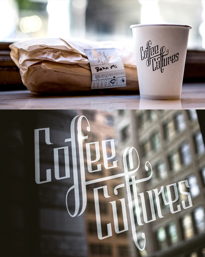
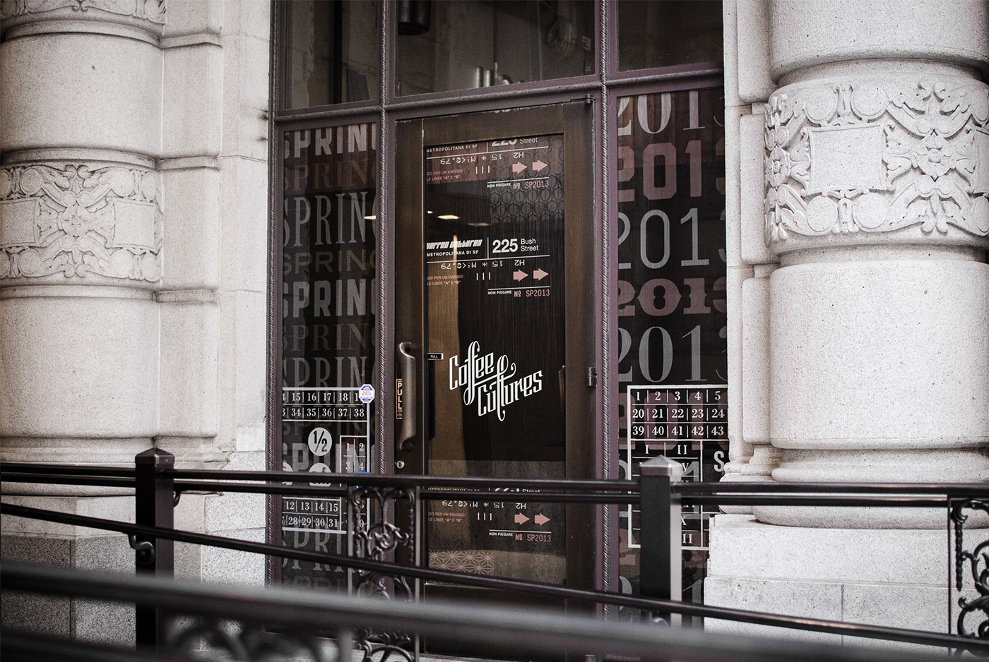
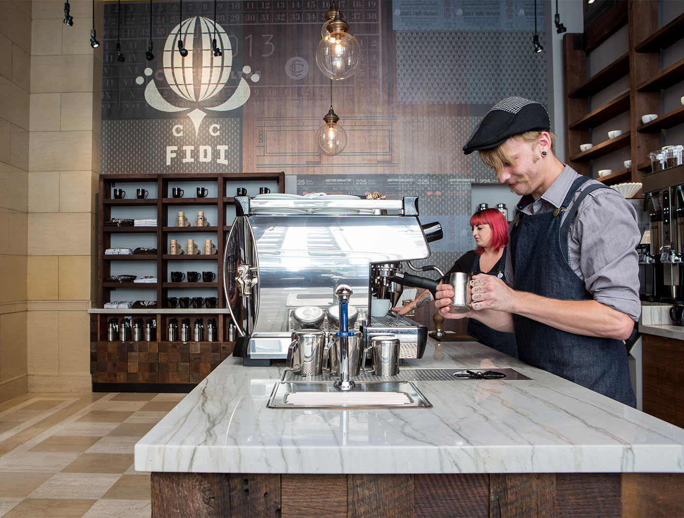
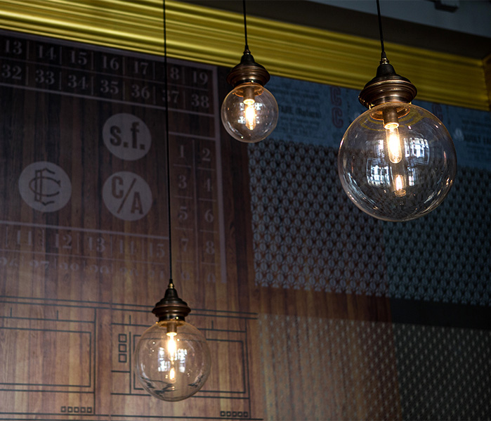
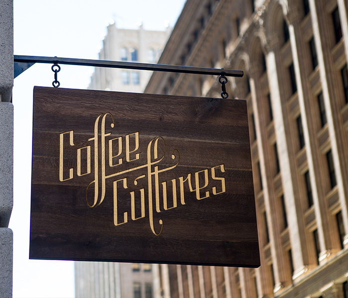
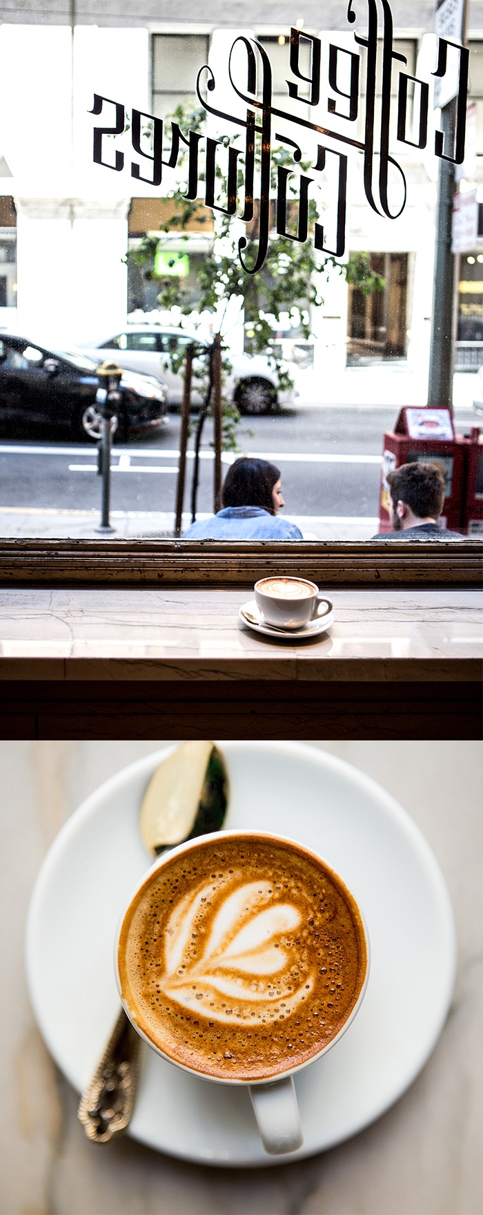
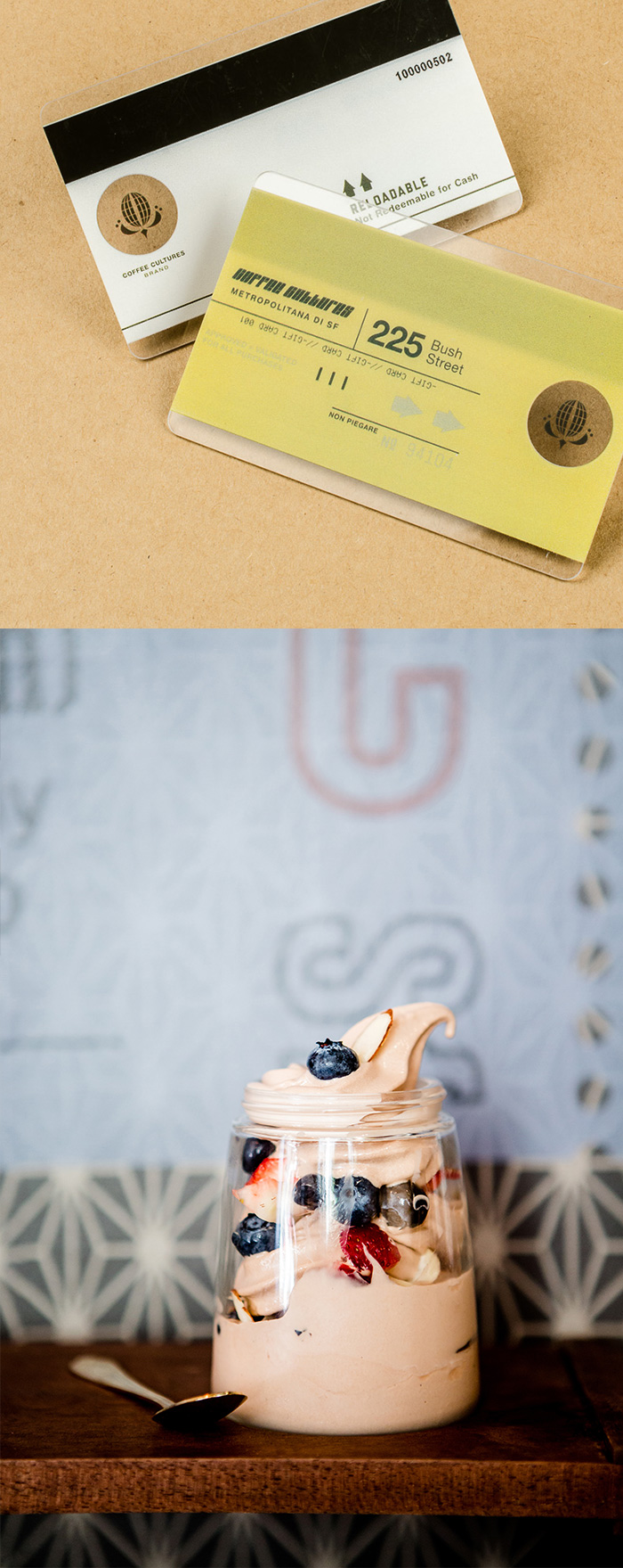
Custom created letterforms applied in gold leaf to the restored 1921 storefront exemplify the detail in the identity we created for Coffee Cultures. Their brand story expands to explore travel ephemera echoing old world San Francisco and includes identity, environmental graphics, website and merchandise. Prior to opening, a construction wrap was designed to generate buzz and street level visibility.
Awards
2014 PRINT Magazine’s Regional Design Annual Best of Region award
2014 Communication Arts Typography Annual — Award of Excellence (logo)
2013 Communication Arts Design Annual — Award of Excellence Environmental Graphics (for construction wrap)
2013 HOW International Design Award — Merit Award


![]()
![]()

![]()
![]()
![]()