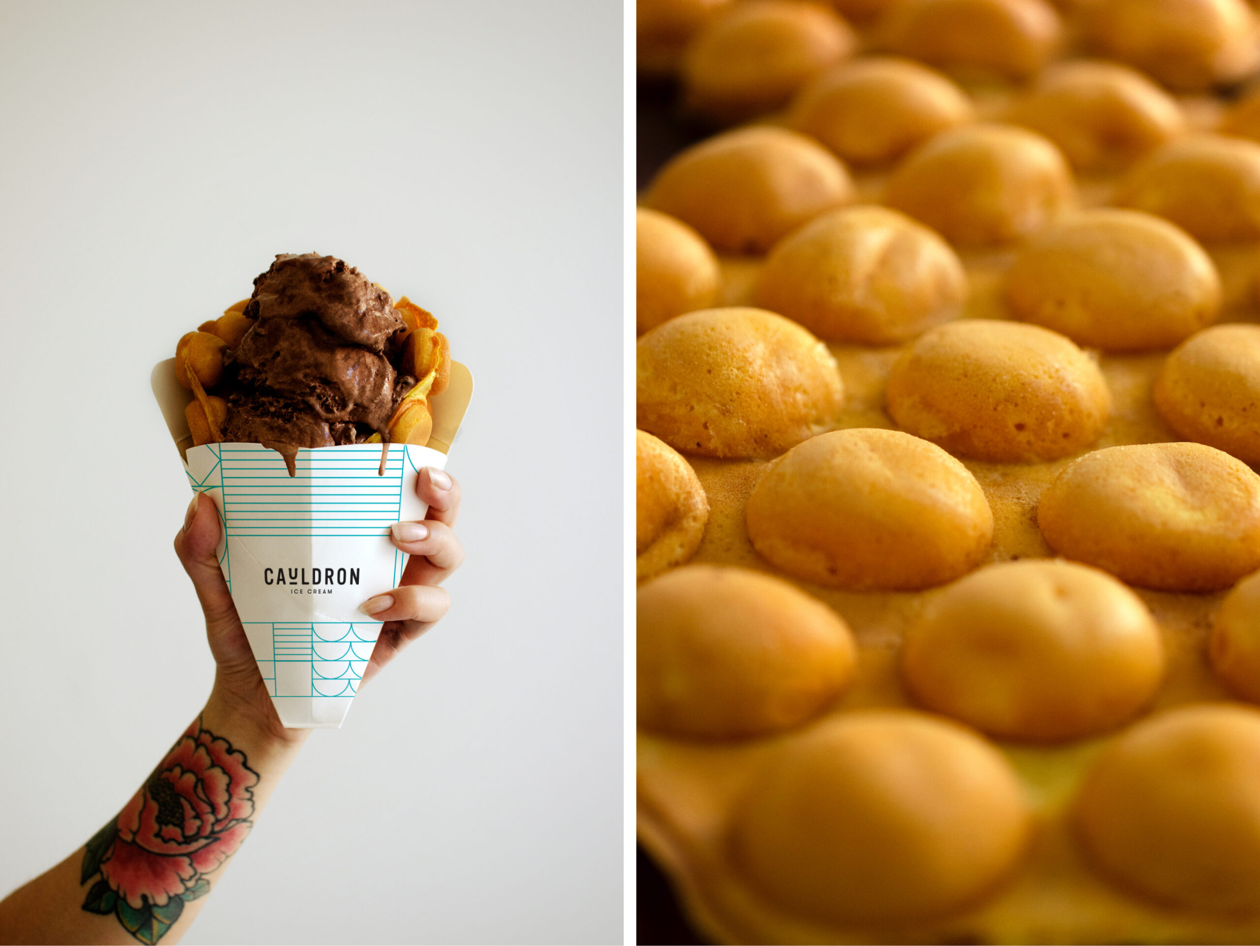
It’s no surprise that Cauldron Ice Cream’s “puffle” cones and beautiful frozen concoctions have gone viral on the internet multiple times. With bustling lines, a growing fanbase, and franchises opening left and right, the founders of Cauldron realized that their current branding, from brand identity to packaging to environment, needed a refresh. We happily became their creative partners—the only caveat was that first we’d get to enjoy their ice cream to our hearts’ (and bellies) content!
Scope of Work
COMPETITIVE RESEARCH
BRAND STRATEGY
BRAND IDENTITY
ART DIRECTION
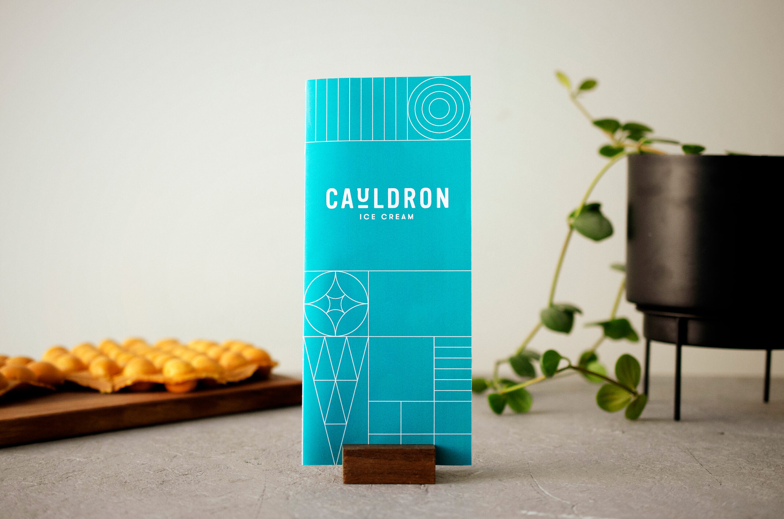
PACKAGING DESIGN
PRINT COLLATERAL
EXPERIENCE DESIGN
Photography
ENVIRONMENTAL DESIGN
|
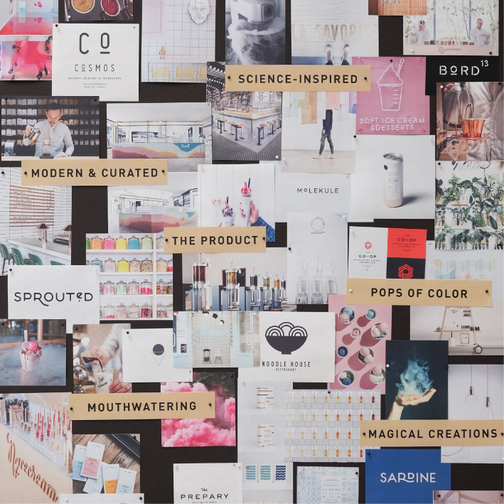
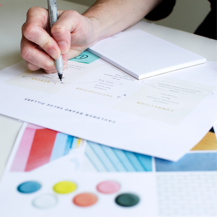
Connection, Satisfaction, and Wonder Chen Design firmly believes that great design is grounded in thoughtful brand strategy. After an inspiring brand workshop with the Cauldron team, we researched, synthesized, and defined a brand ethos that would set Cauldron apart from a crowded marketplace of tasty desserts. Turns out, people love ice cream. But what they love more is the feeling behind sharing ice cream with their favorite people, and that intangible magic is what we sought to make tangible in our brand positioning and foundations. |
|
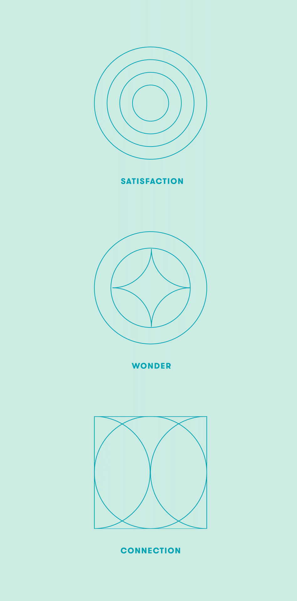
Connection, Satisfaction, and Wonder
Chen Design firmly believes that great design is grounded in thoughtful brand strategy. After an inspiring brand workshop with the Cauldron team, we researched, synthesized, and defined a brand ethos that would set Cauldron apart from a crowded marketplace of tasty desserts. Turns out, people love ice cream. But what they love more is the feeling behind sharing ice cream with their favorite people, and that intangible magic is what we sought to make tangible in our brand positioning and foundations.
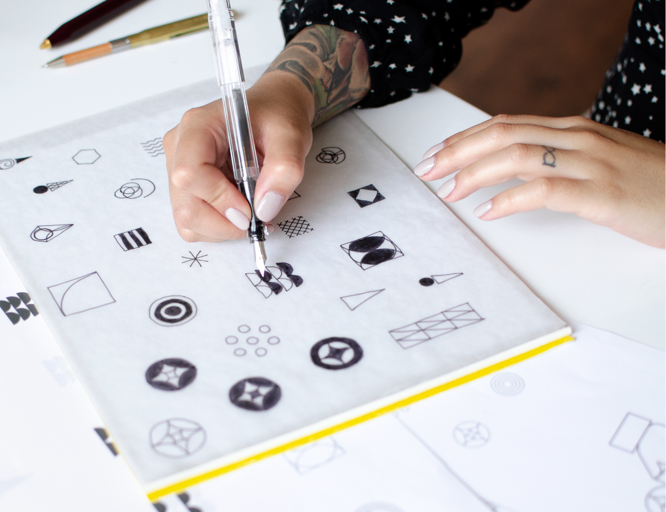
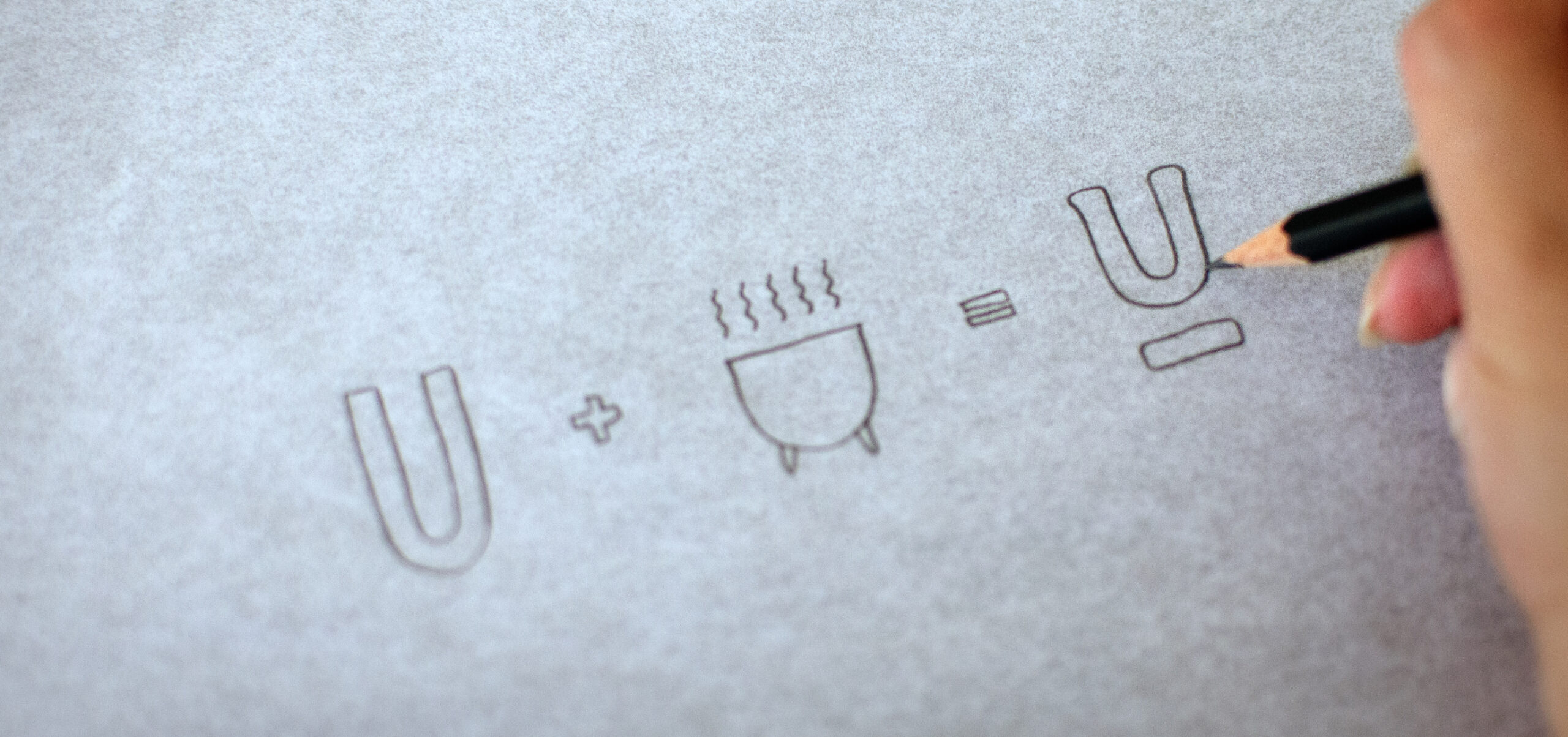
Crafting a Memorable Identity
The goal was to build an identity that embodies Cauldron’s brand pillars: connection, satisfaction, and wonder. Our team explored how a balanced interplay between playful and refined could come to life. A neutral palette with pops of color, timeless iconography, and clean typography (with a nod to the “cauldron” where ice cream is freshly made) all came together to rebuild Cauldron’s image.

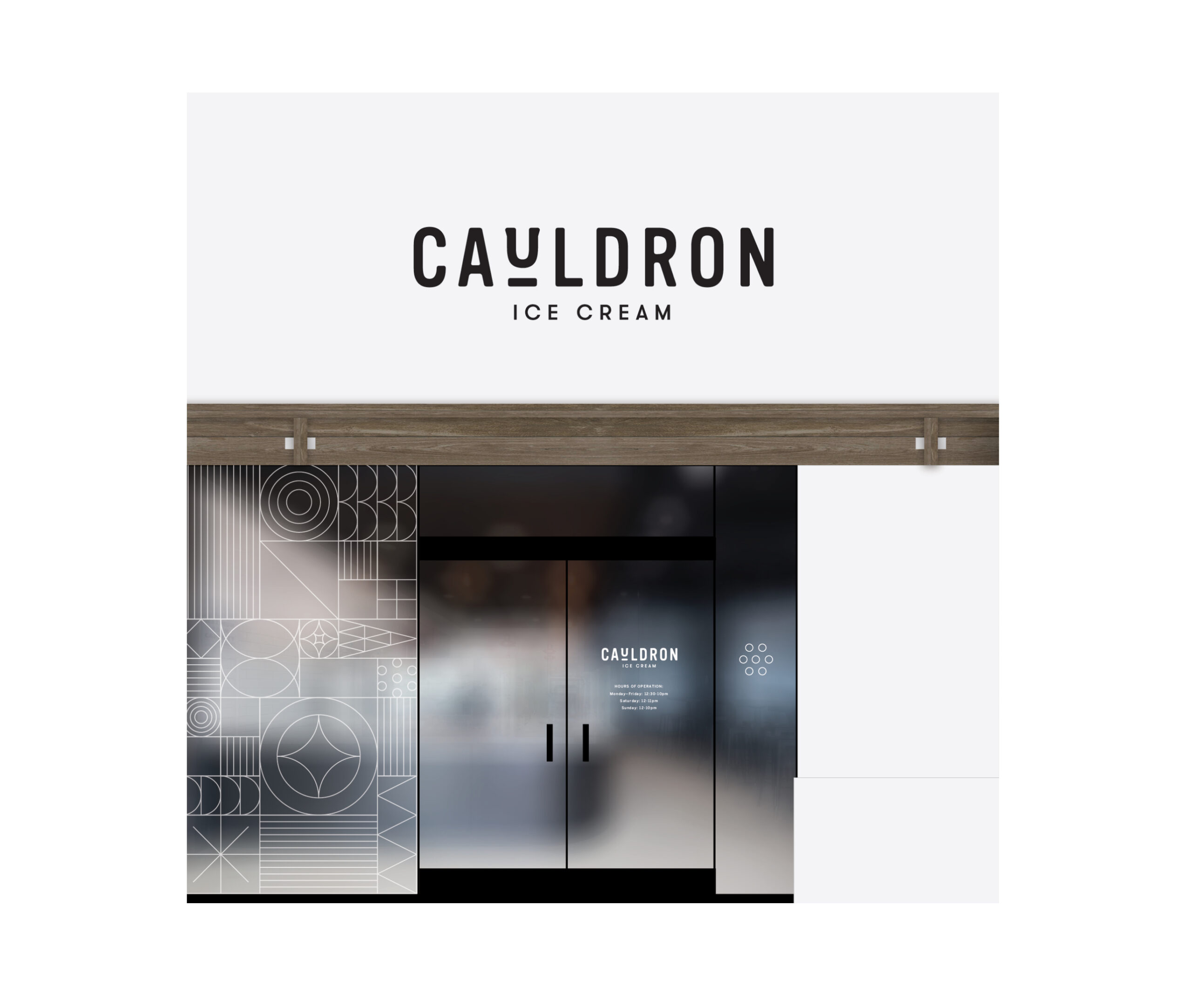
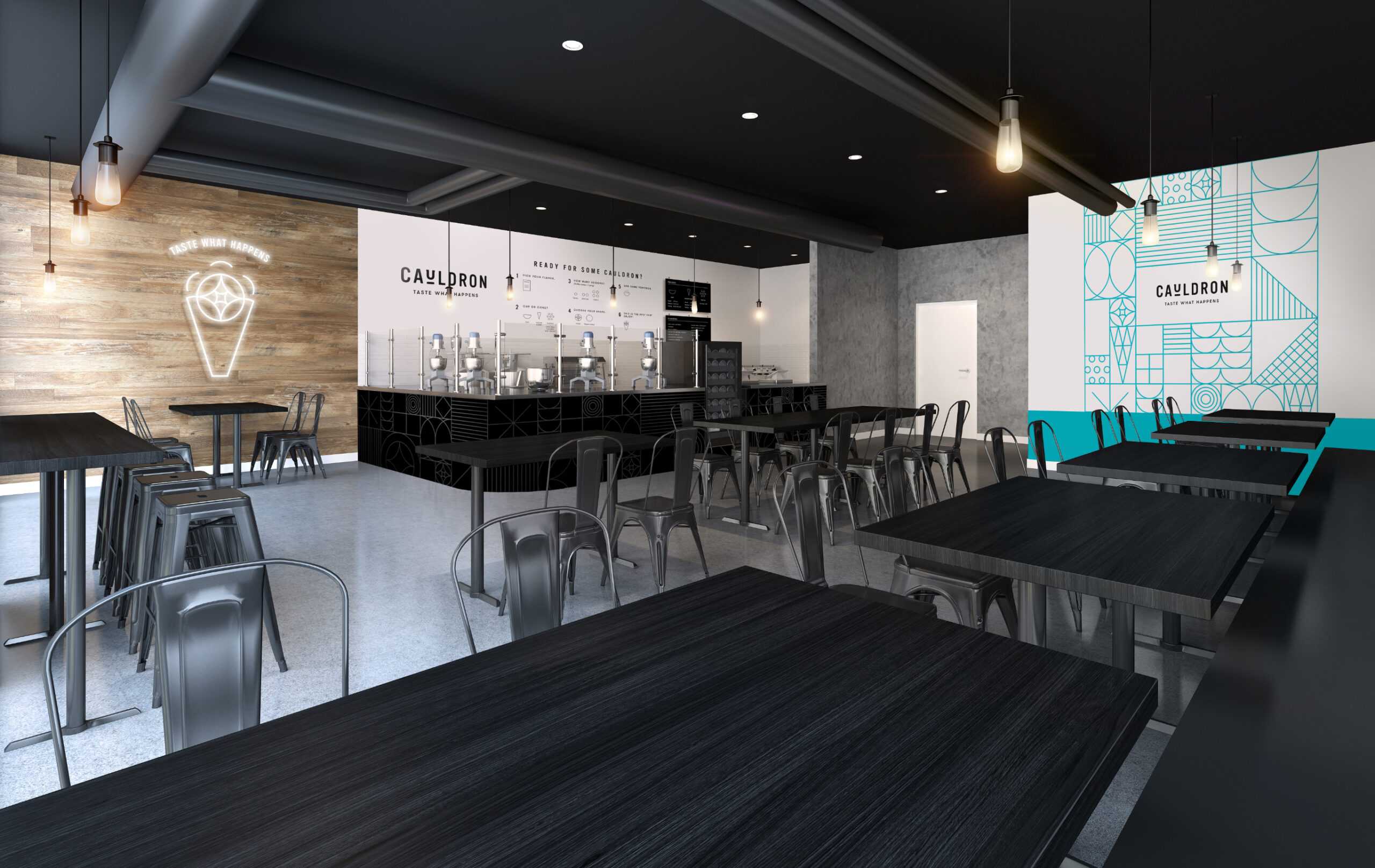
Cauldron IRL
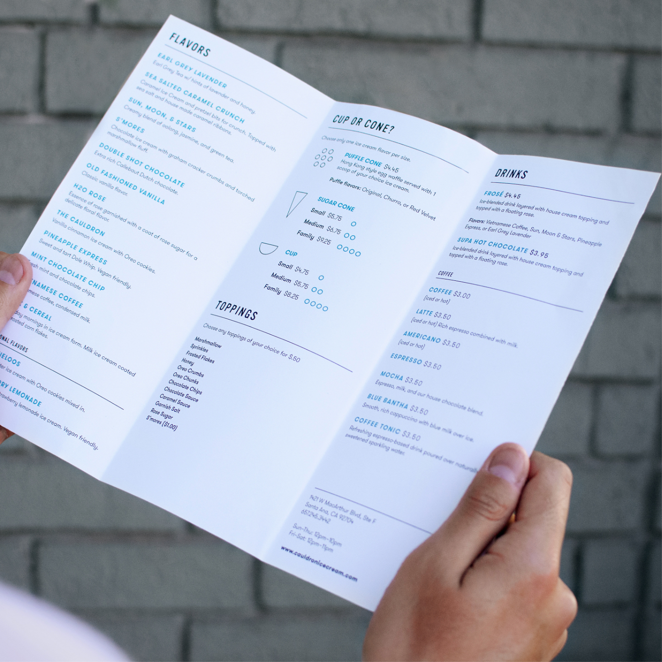
From the exterior signage, to the menu board, cashwrap, and wall graphics, we stepped into the customers’ shoes to reimagine and improve the Cauldron experience so that every moment would be memorable. We built menu boards that clearly guide customers into selecting and understanding the many product offerings, and created fun, Instagrammable moments throughout the store.