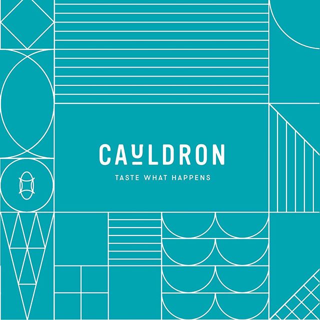
Our team explored how a balanced interplay between playful and refined could come to life. A neutral palette with pops of color and clean typography (with a nod to the “cauldron” where ice cream is freshly made) all came together to rebuild @cauldronicecream‘s image. Take a look at the full case study through the link in bio. #chendesign (2/3)
May 14, 2019
Mailing List
Enter your email below for exclusive news and juicy details.