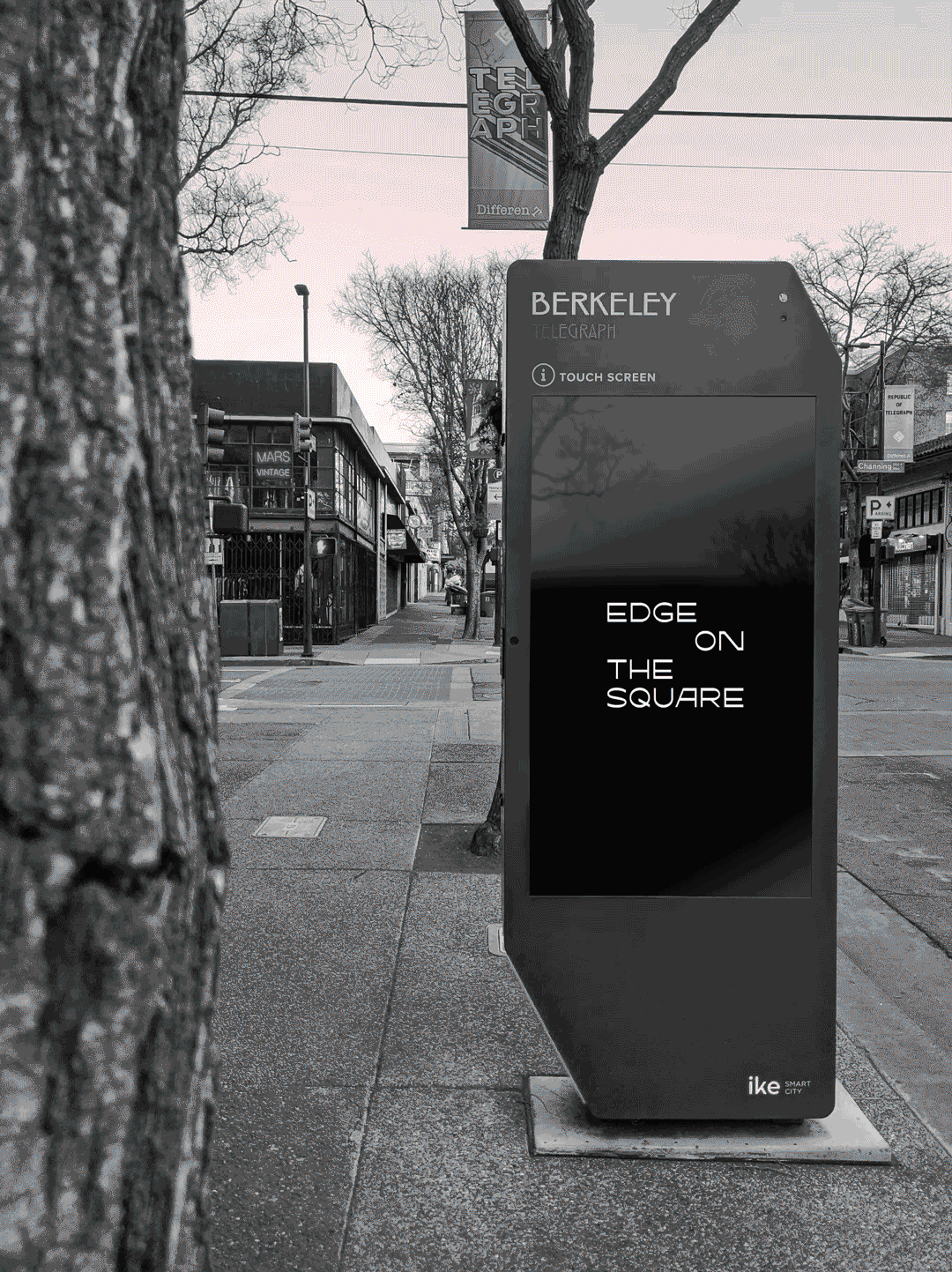
Unexpected, evocative, and transformative, Edge on the Square is a new hub and socio-economic catalyst in the heart of San Francisco Chinatown. Its contemporary art festivals and community experiences celebrate creativity, culture, and history — engaging residents and visitors alike in a movement toward positive social change.
Edge on the Square is a project of Chinatown Media & Arts Collaborative, an unprecedented coalition of six SF-established AAPI institutions. Its leaders entrusted us to create a new brand identity system rooted in the ambitious enterprise’s origins and aims to represent the community for years to come. Our work would help give shape to aspirational architectural plans and be able to skillfully present other artists’ work while establishing its own distinct brand in the SF arts and culture ecosystem and beyond.
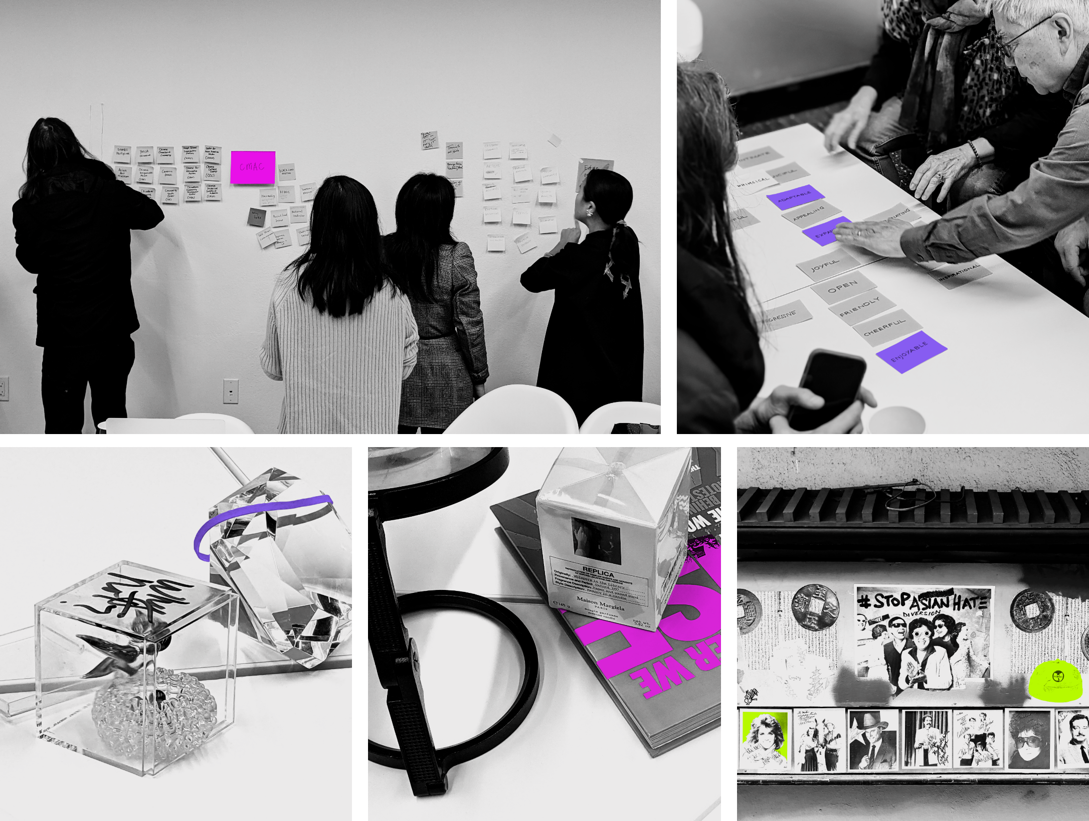
We began by listening deeply to the leadership’s passion for the history, present moment, and future of the community. Insightful and complex, their dreams for Edge on the Square encompass celebrating the creativity and resiliency of the AAPI community to being a catalyst for racial justice and serving as a model for the country. We were grateful to gain insider understanding of Edge on the Square’s unique potential through in-depth interviews, gleaning from their wealth of leadership experience, curatorial expertise, and political activism.
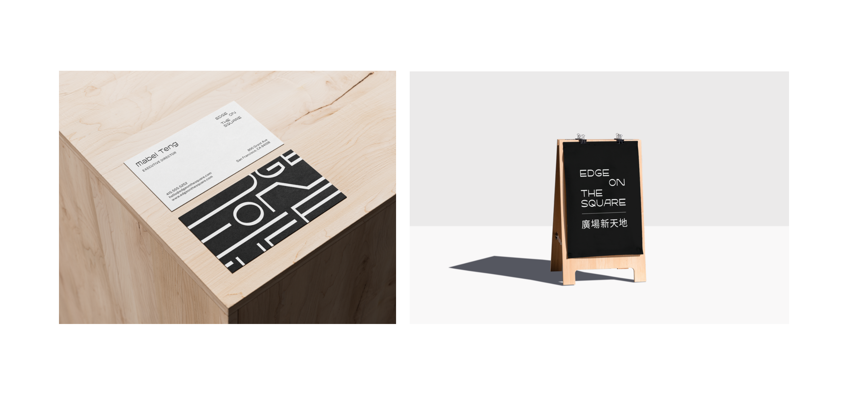
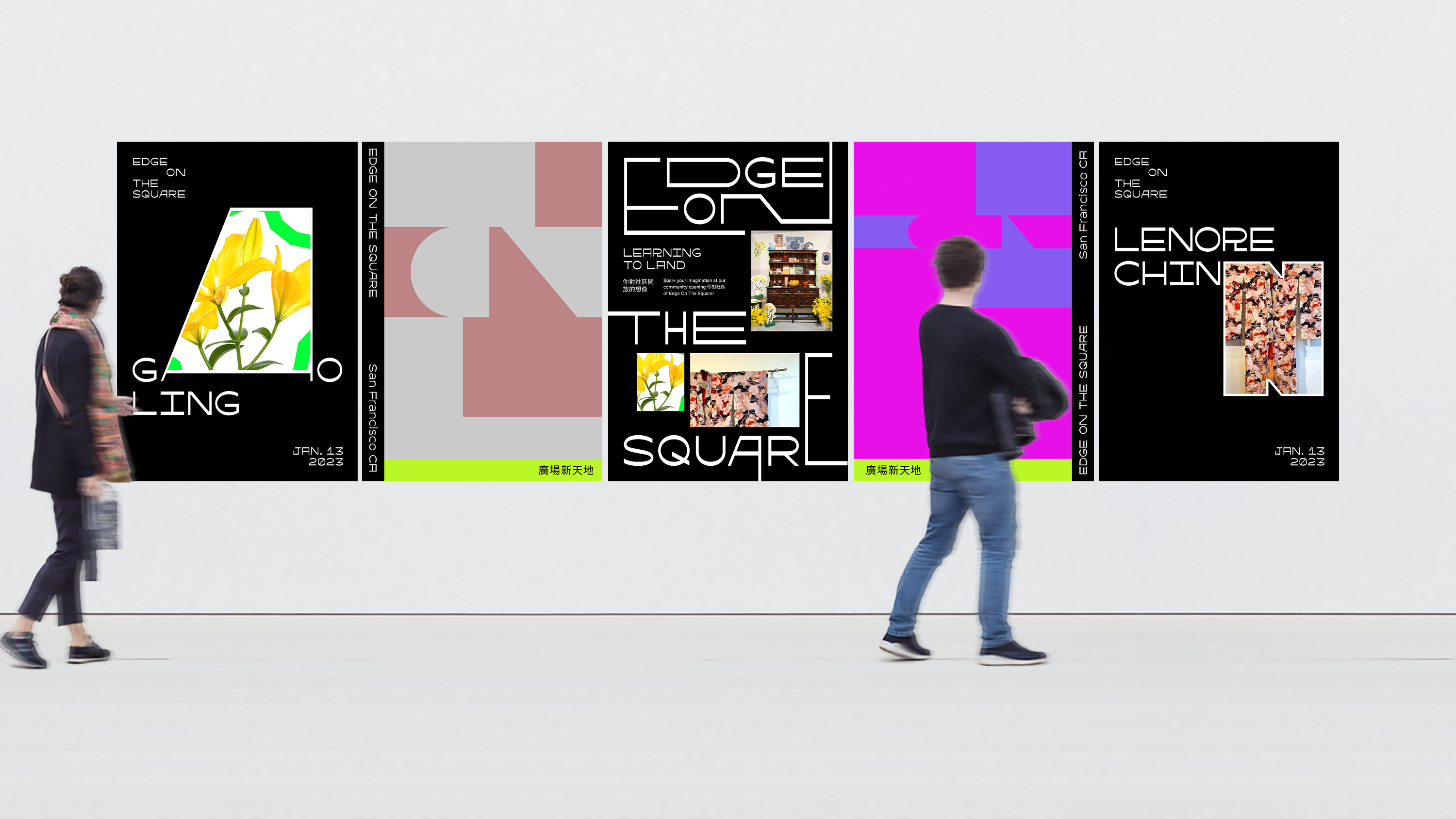
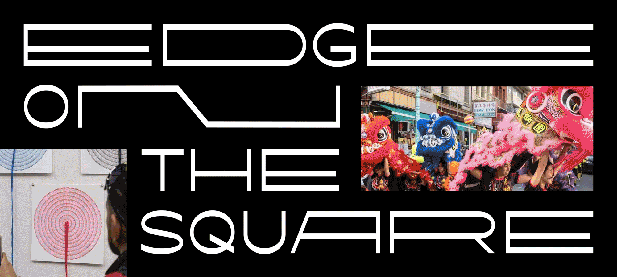
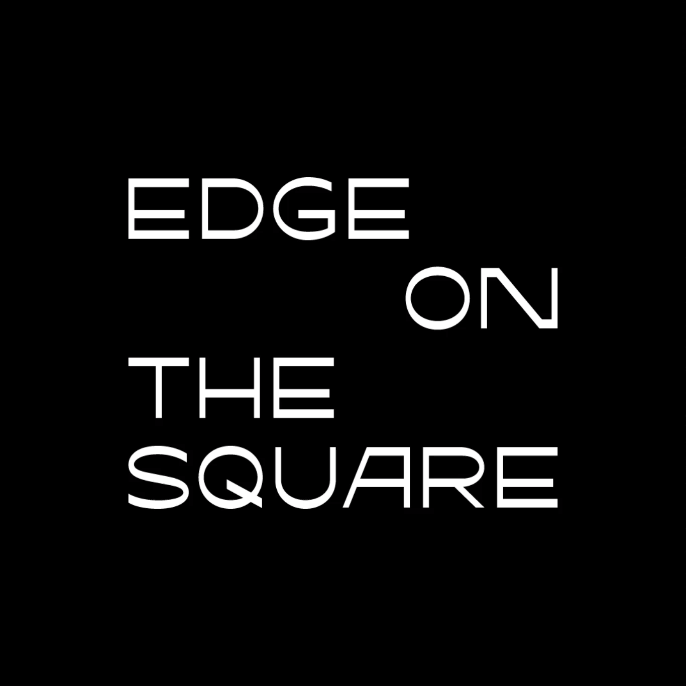
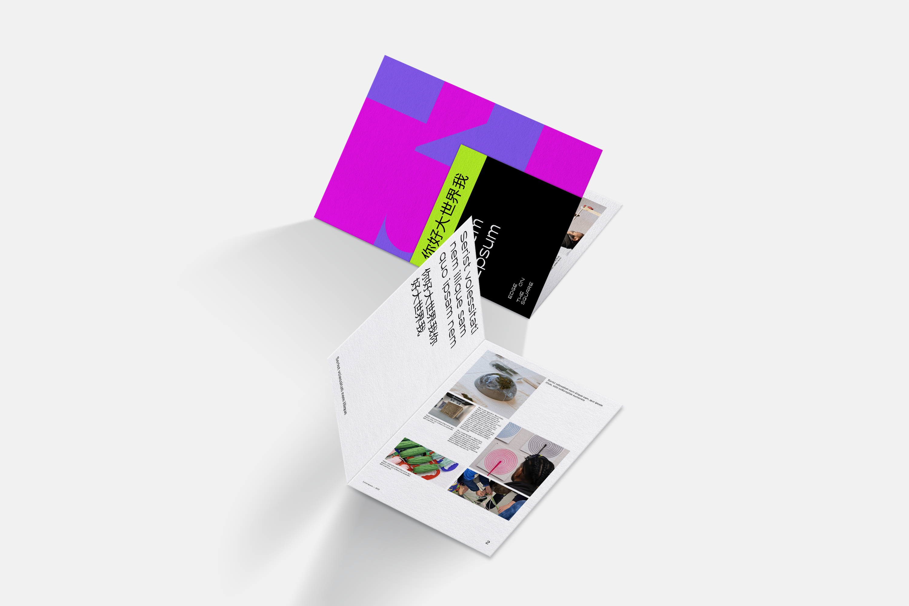
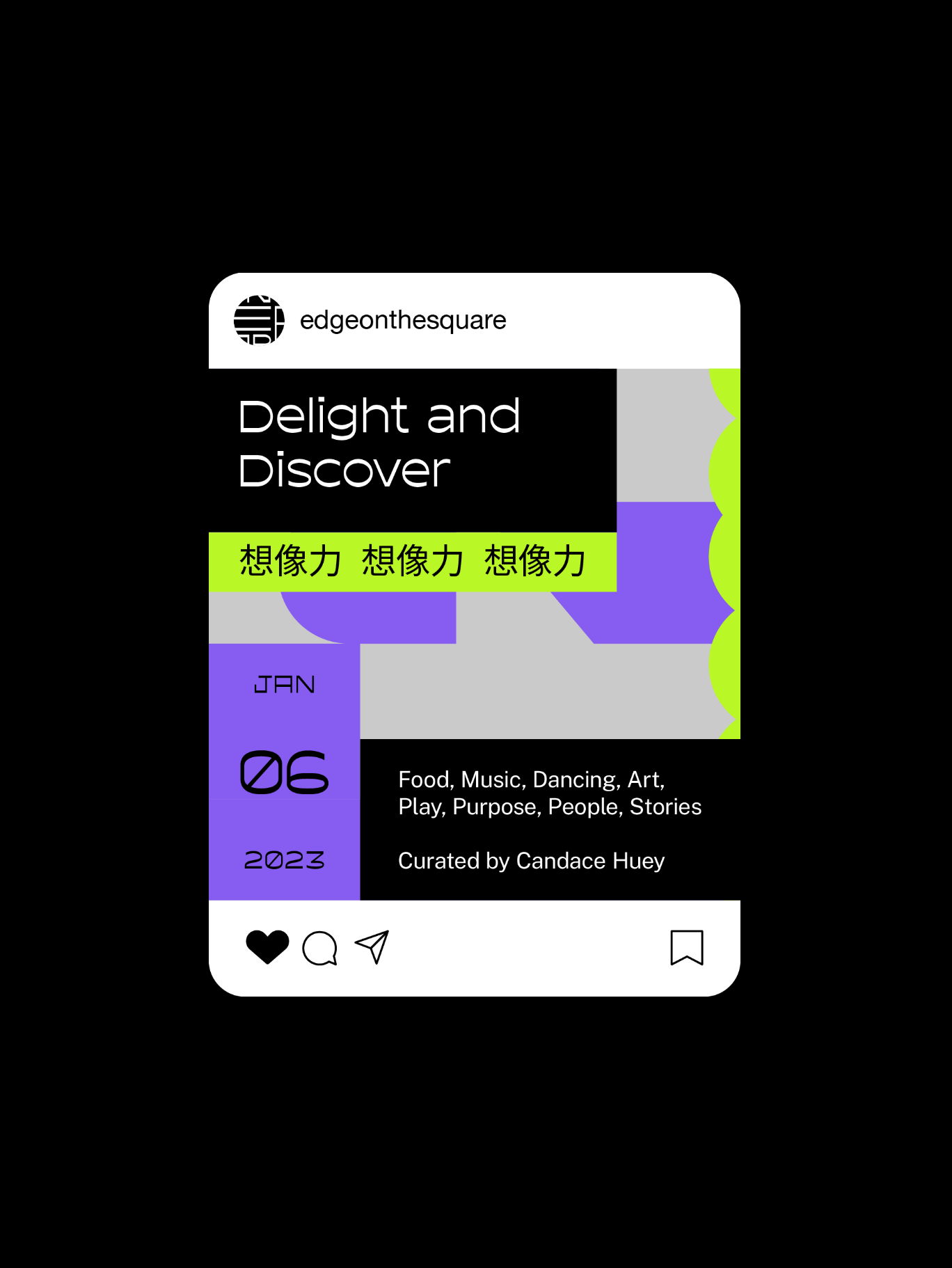
Our team presented a wide range of conceptual solutions and this winning direction hints at the physical and metaphorical gathering square. Embodying an ethos of elasticity with letters stretching and contracting, the new logo expresses the tension and coming together over unconventional art and immigrant storytelling. It also reflects living, ever-changing media, programs, and conversations, making the logo a dynamically flexible frame for the work of diverse guest artists while standing on its own, in English and in Chinese.
Scope of Work
Discovery Workshop
Brand Strategy
Visual System
Identity System
Brand Experience
Art Direction
Marketing Collateral
Brand Guidelines
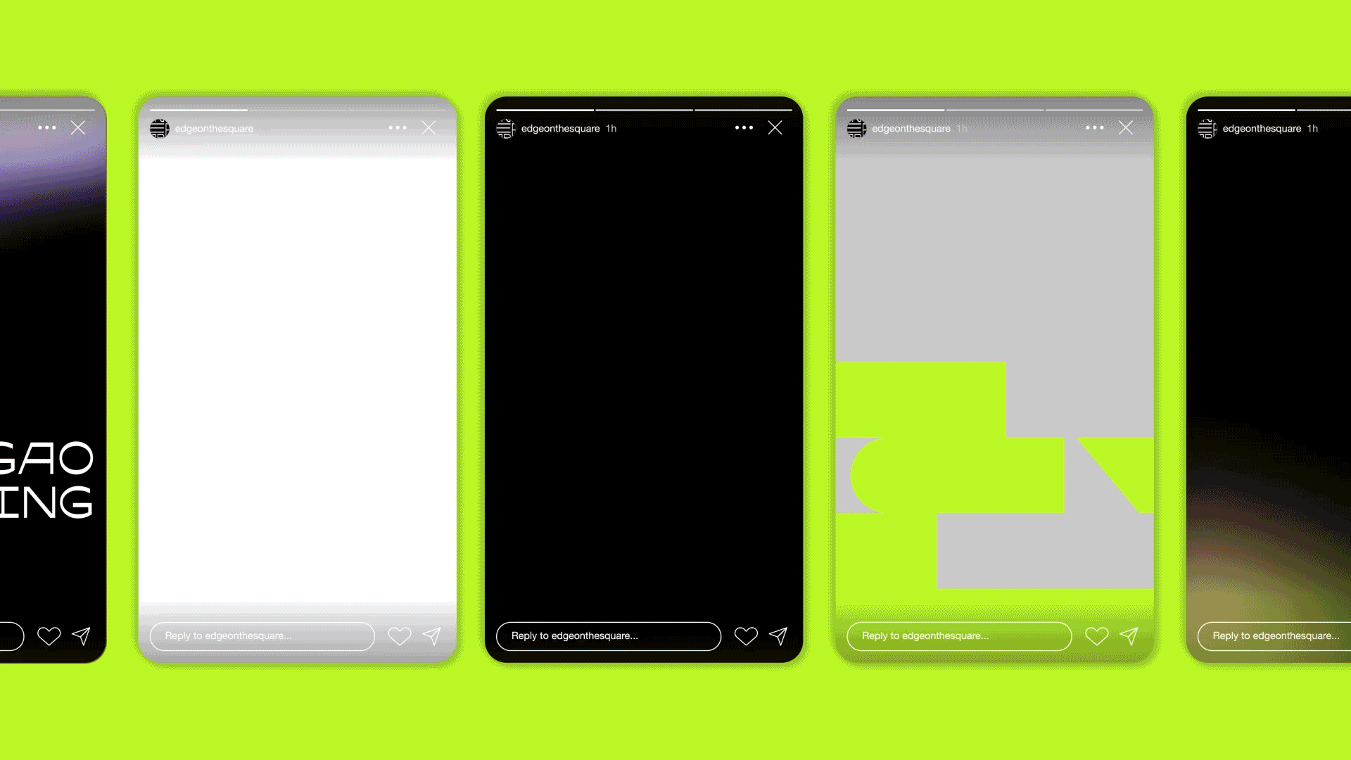
For the main typeface, we resonated with the letter forms and sensibilities of Asian American type designer, Heejae Yang. It was also important for us to infuse the primary black and white palette with unexpected supporting colors in electric, punk-inspired combinations. These infuse a vitality and interesting visual range for printed and digital marketing collateral. We provided a brand toolkit and guidelines that provide the foundation for in-house designers to carry the brand into its collective future with strategic design intention.
“CDA’s rigorous methodology, creative innovation and empathic reflection were demonstrated at each stage of development. They understood that the work we are doing together is more than branding — it’s telling the story of a people, place and purpose that resonates with us all as a collective community.”
Linda Lui, Head of Marketing & Communications, Edge on the Square