COMING FULL CIRCLE
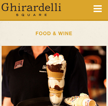
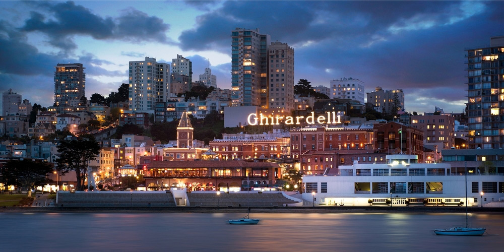
Stewarding a long-lived institution well takes dedication, perseverance and renewed vision to stay relevant and yet rooted. Not an easy task to be sure and San Francisco’s Ghirardelli Square has had its highs and lows over its 150-year history. Home to the eponymous chocolate company’s U.S. flagship store, shops, restaurants and a distinctive Fairmont Hotel property, the 12-building, 99,551 square-foot retail complex continues to be visited by 12.4 million tourists every year despite high vacancies and a faded mystique.
But new management has hit the ground running. Jamestown Properties purchased the site with the retail development expertise and desire to turn this global destination into an updated version of its former glory. CDA has enjoyed a long successful relationship with Jamestown on other many development projects. They engaged and entrusted CDA to refresh Ghirardelli Square’s brand and completely overhaul its website.
“It was a huge honor and privilege to work on a brand refresh and web redesign for such an iconic San Francisco destination.”Joshua Chen, Principal & Creative Director, Chen Design Associates
our project started with a field trip to the square to take in the current situation.
Jamestown Properties plans improvements on the ground that focus on bringing in unique retail shops and restaurants. In line with this, the rebranding and website aim to raise the experience of visiting Ghirardelli Square to be worthy of its national historic landmark status and of living into the greater potential of drawing international tourists and discerning locals alike.
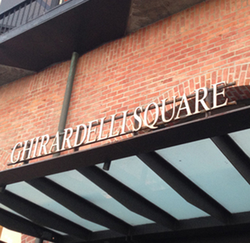
Over the years, Ghirardelli Square has been represented by no fewer than five different logos and brand expressions on site, in various collateral, signage and its website. The result is a confusing and weak brand identity for visitors. Ghirardelli Square’s latest large-scale rebrand iteration was a script logo that evoked a spa getaway — certainly a beautiful idea but not accurate to what Ghirardelli Square is, delivers or resonant of its lively atmosphere near Fisherman’s Wharf.
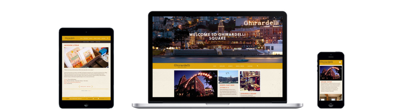
OUR GOALS FOR ghirardelli square’s website:
- 01
- Easy navigation, high interactivity
- 02
- Brand identity aligns with Ghirardelli Square’s authentic, historical ethos
- 03
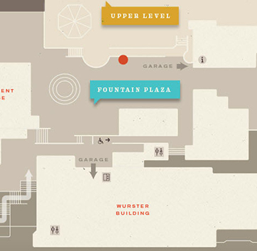
- Empowered way-finding
Archetypes
Scope of Work
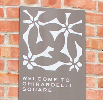
to thine own self be true
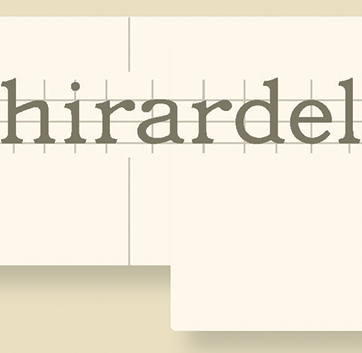
“We brought back the authenticity of the place, with the logo based on the original rooftop signage which still stands today and that everyone recognizes as part of the landscape and representative of the Square. While on one hand it seemed to be something of a ‘no-brainer, of course we’d do that’ — refining the letterforms and paying attention to the details of each letter and its relationship within the word itself, further updating it for a new generation was something we relished and took joy in crafting.” – Josh Chen, Principal & Creative Director, Chen Design Associates
“We brought back the authenticity of the place… refining the letterforms and paying attention to the details, further updating it for a new generation was something we relished and took joy in crafting.”Joshua Chen, Principal & Creative Director, Chen Design Associates
OUR SOLUTION
The new, updated logo honors the iconic heritage rooftop sign that people recognize the world over.
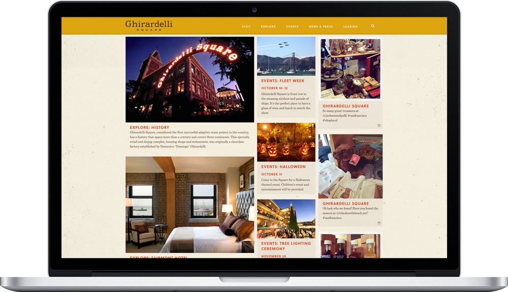
The home page features three columns of “endless” rich content — Ghirardelli Square retailers and history featured on the left, events in the middle, and images from the Square’s Instagram feed in the right column all give the home page an ever-changing mix of ways to explore the site.
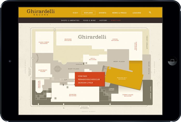
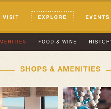
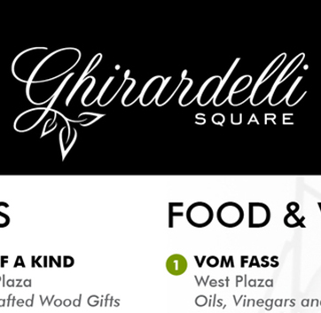
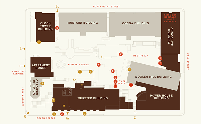
Interactive site directory allows viewers to find the right level of detail that they need on each of the retail shops and restaurants at Ghirardelli Square.